M+ Visitor Wi-Fi User Interface
A common access point for museum visitors
M+ approached Nic Chan and Jimmy K.K. Lam of Studio Earth to develop their visitor Wi-Fi interface. The main challenge was to integrate the museum's extensive visual identity while ensuring the use of visual elements to meet accessibility standards.
Team
Nic Chan on development, Jimmy K.K. Lam of Studio Earth on user experience and interface design, and Jarijn Nijkamp on user experience and project management.
Digital and Editorial Content at M+
Alexis Yip, Catherine Erneux, Kingsley Man, Nicholas Leung, William Smith
M+ attracts visitors from diverse backgrounds and abilities and aspires to design user touchpoints that are inclusive and accessible. We aim to develop a platform that incorporates those standards.
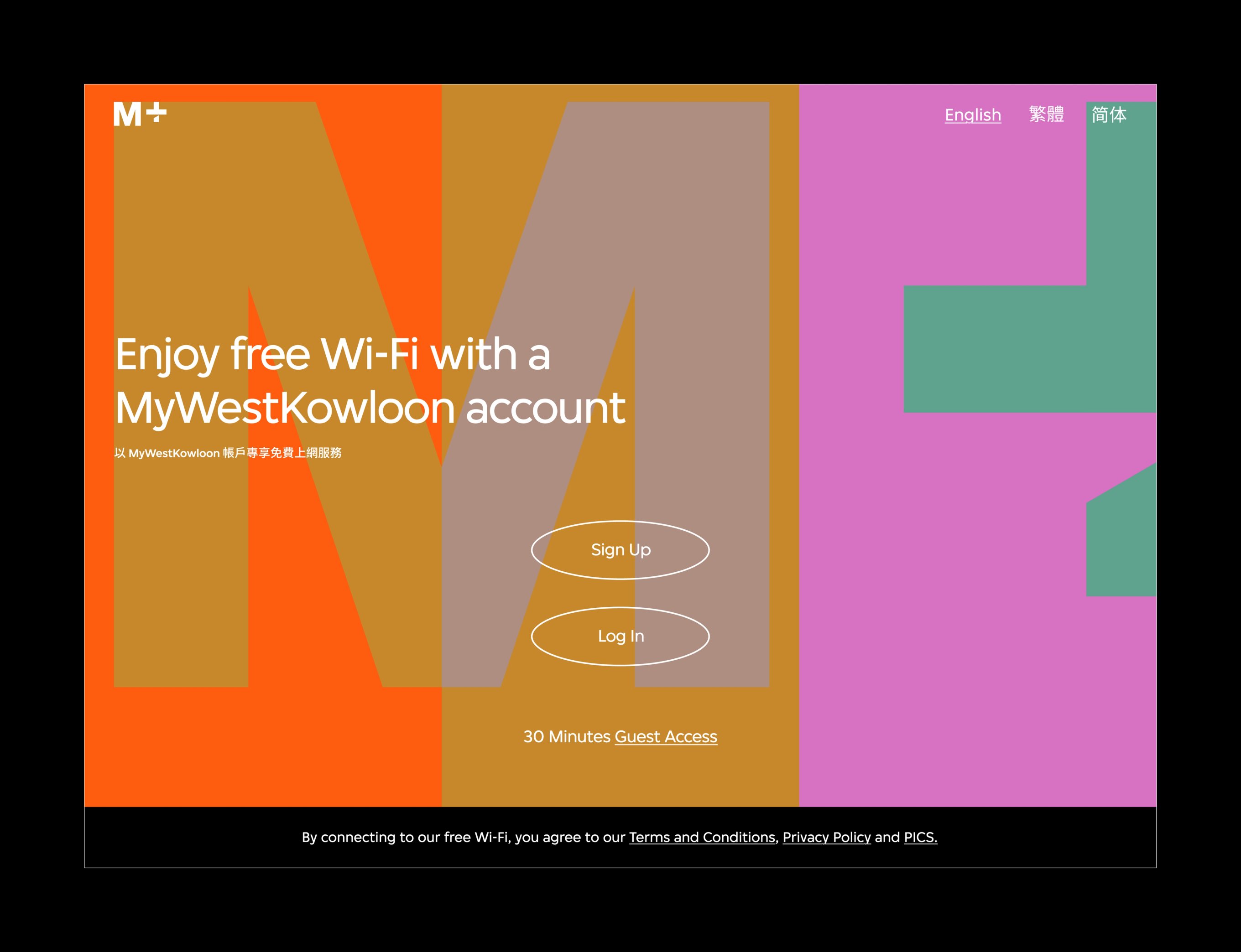
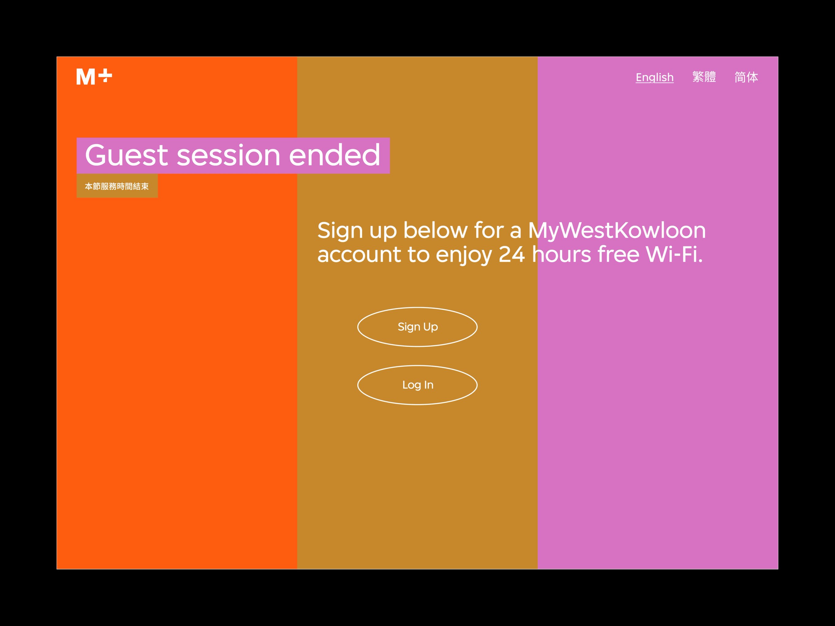
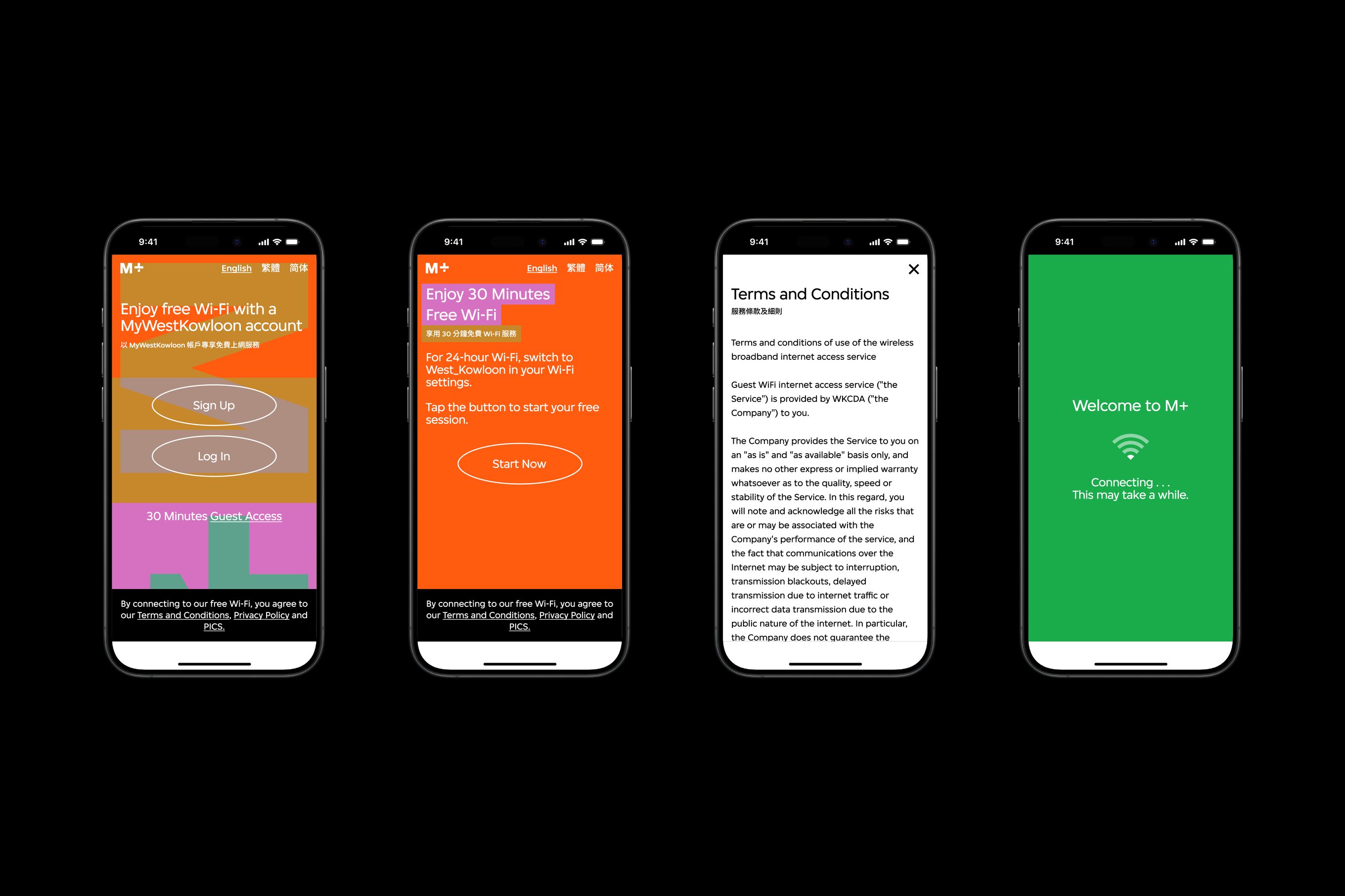
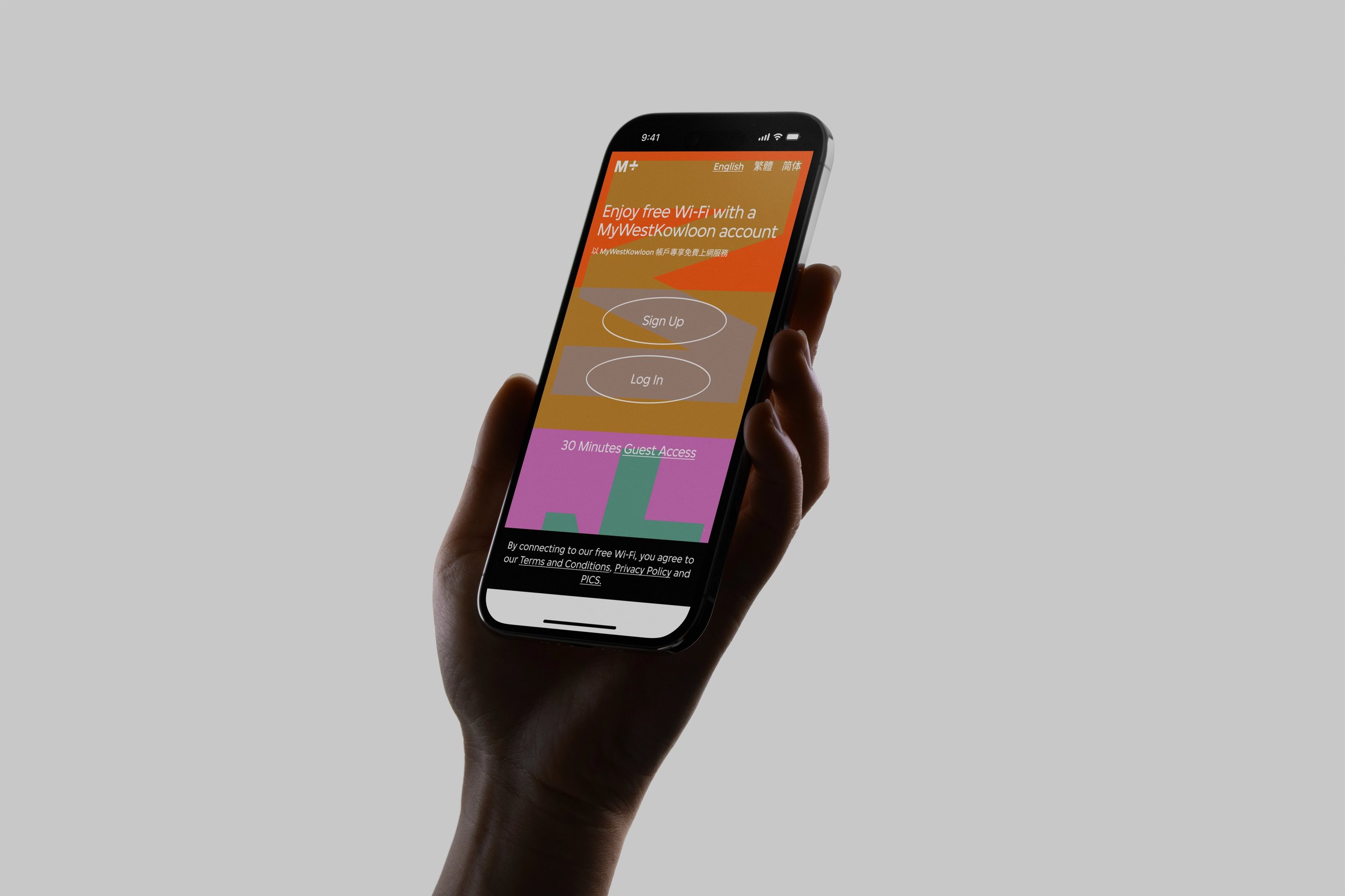
The museum's Wi-Fi network interface incorporates the typography and colour palette of the M+ visual identity guideline, created by the Amsterdam-based design collective Thonik.
In addition, the interface's visual language parallels that of the primary M+ website, adopting typography, tri-coloured grids, and interactive elements created by designers Anton and Irene in New York.
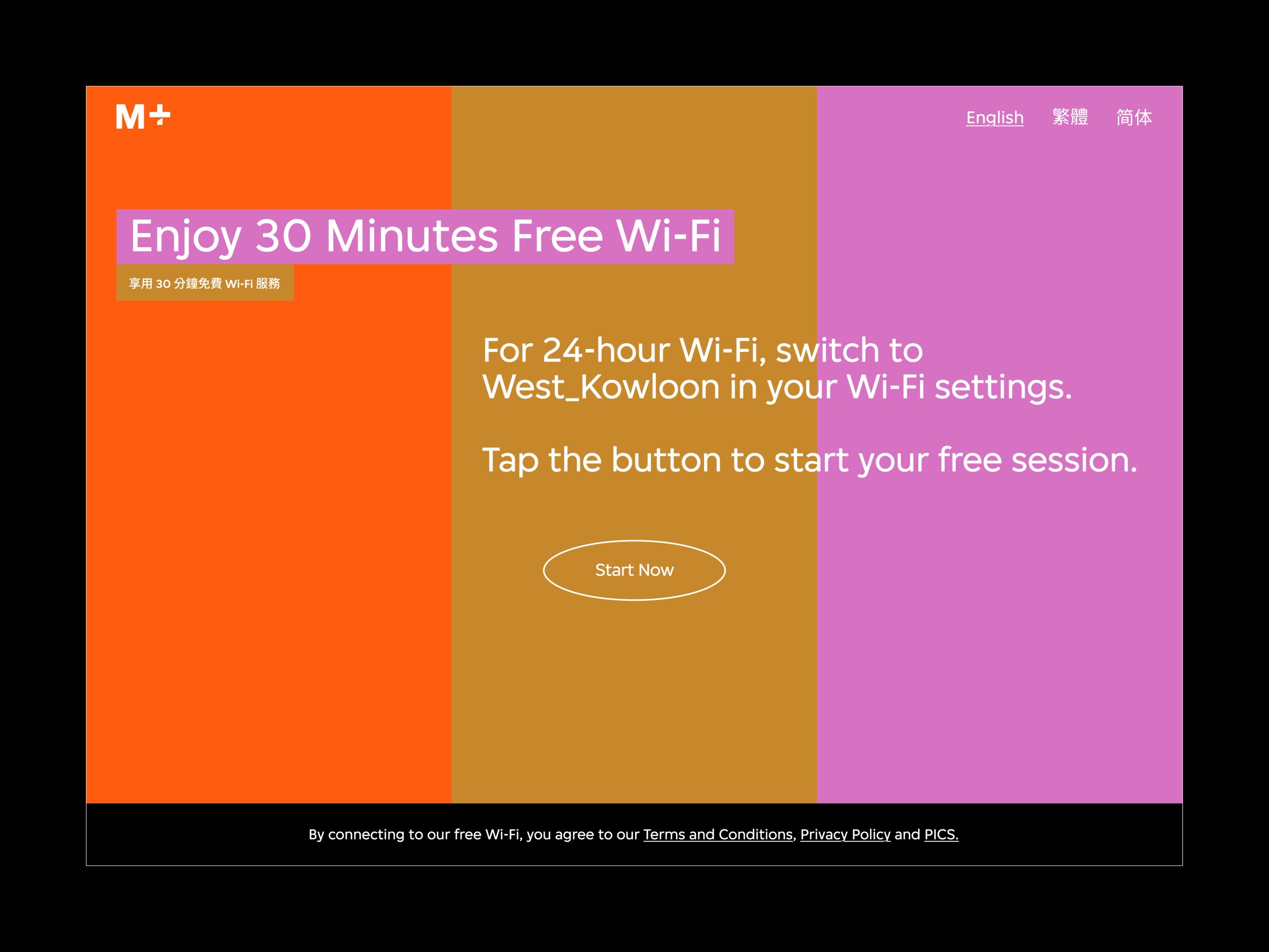
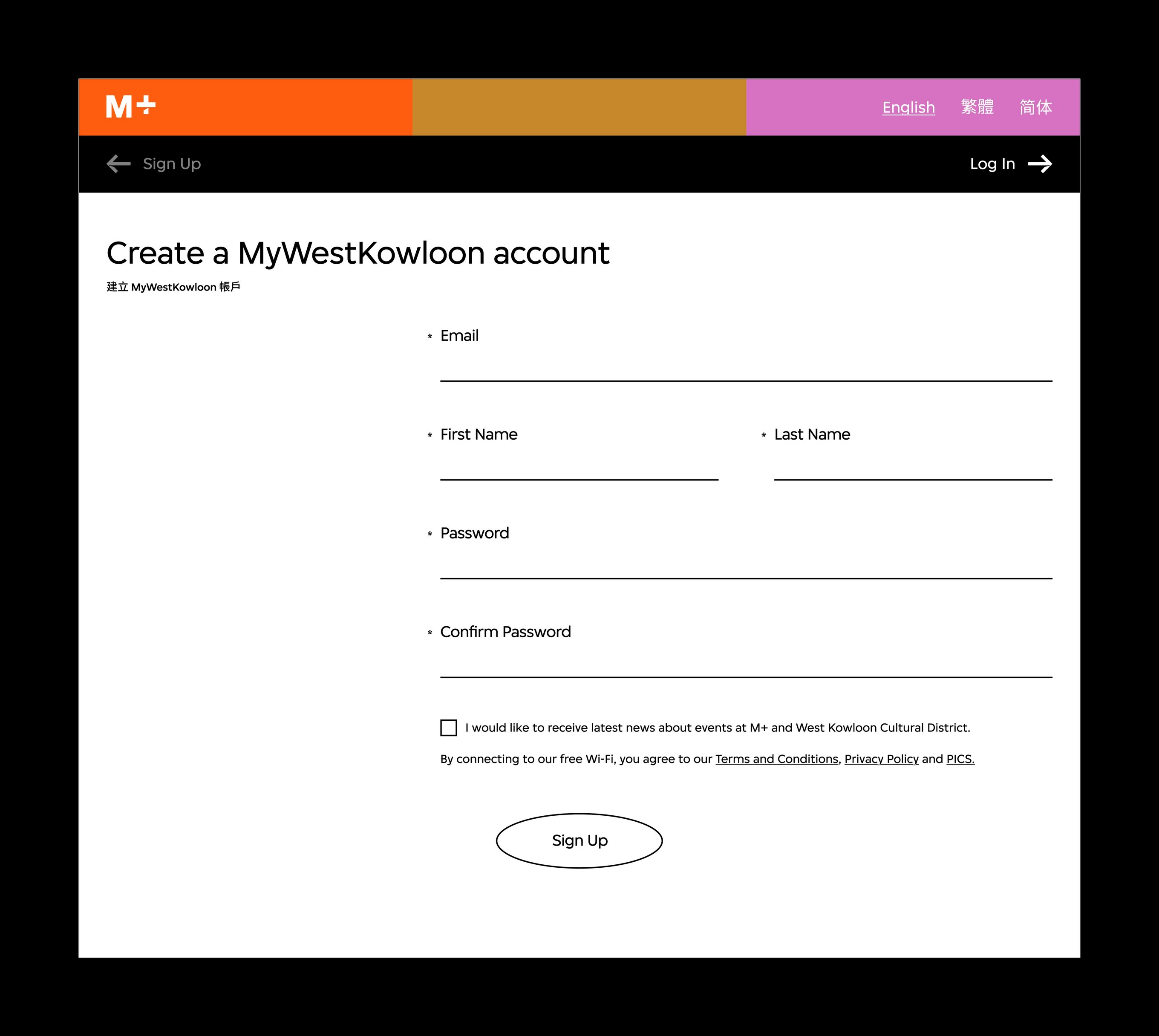
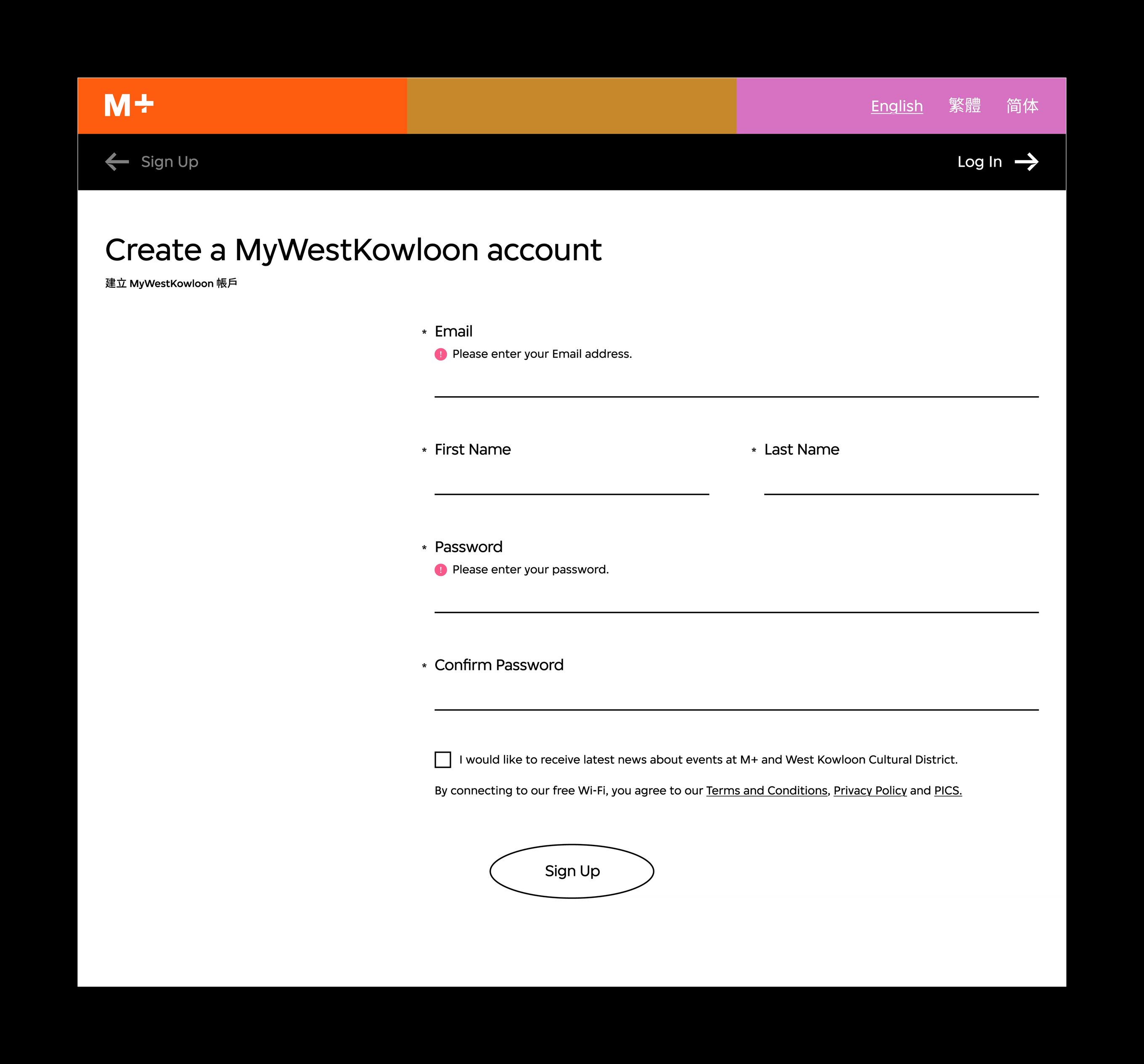
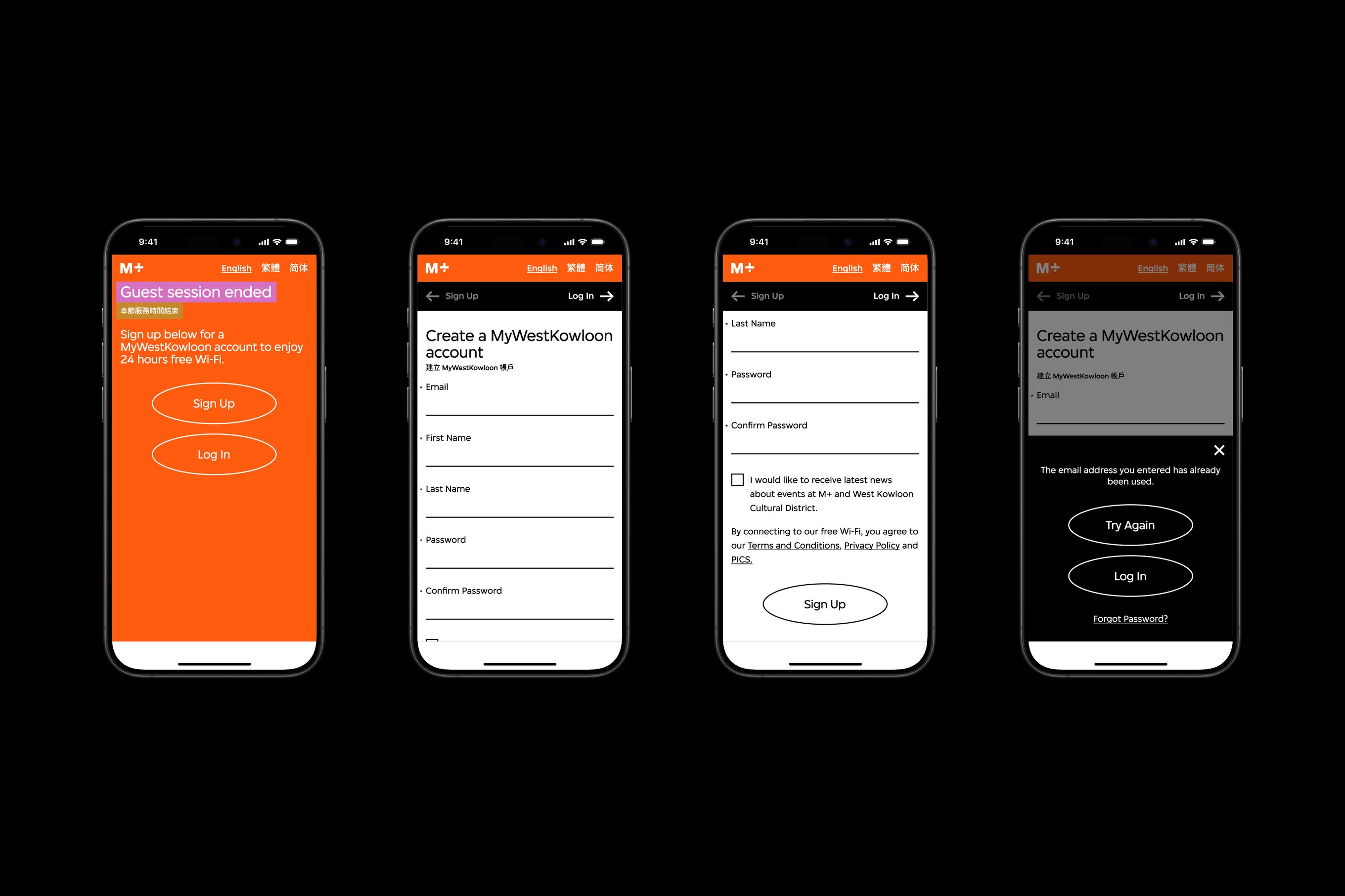
Our selection of hues from the M+ colour palette represents the website's phases and functions. A monotonous treatment on the sign-up page can help visitors focus on important details.
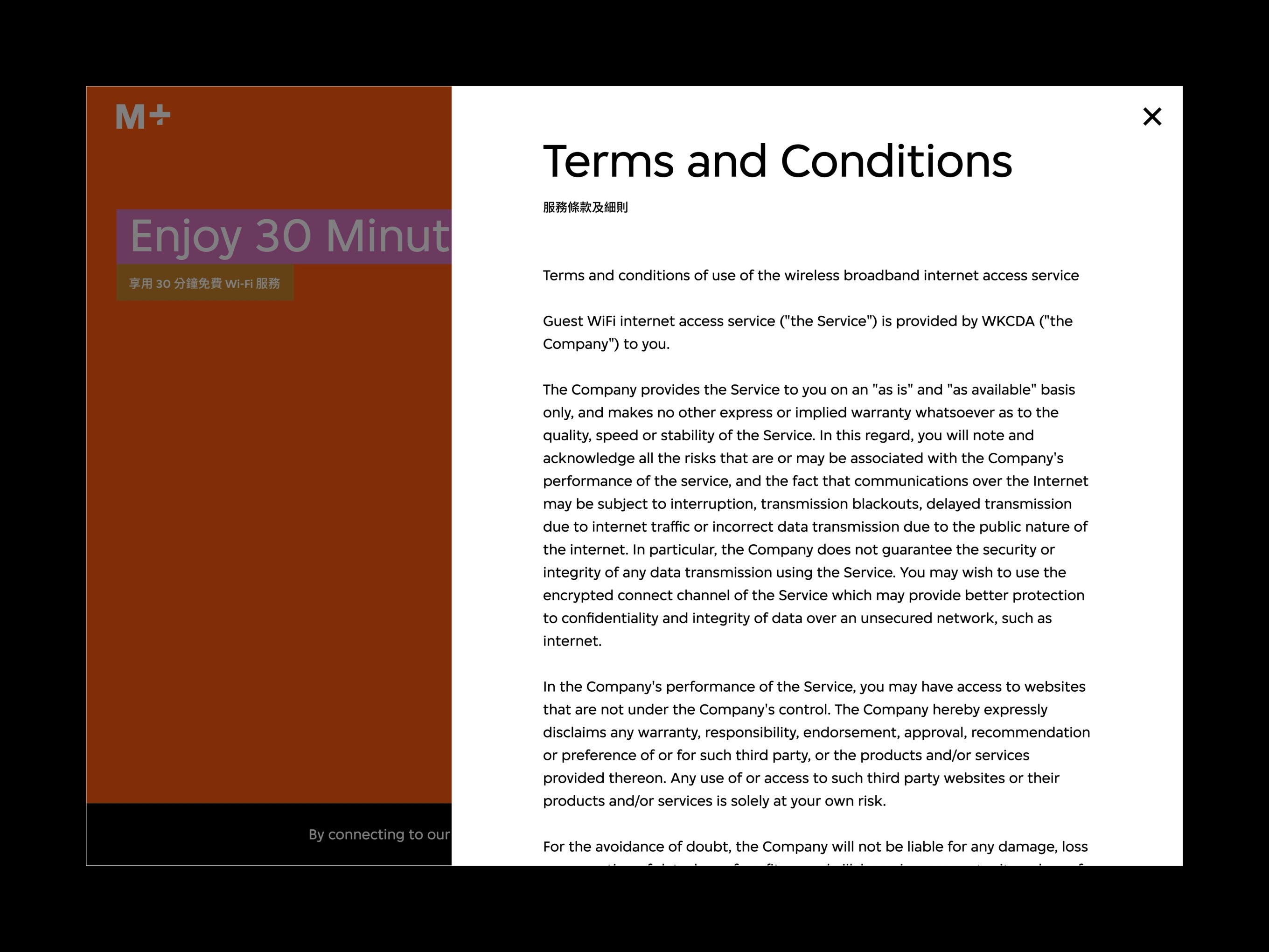
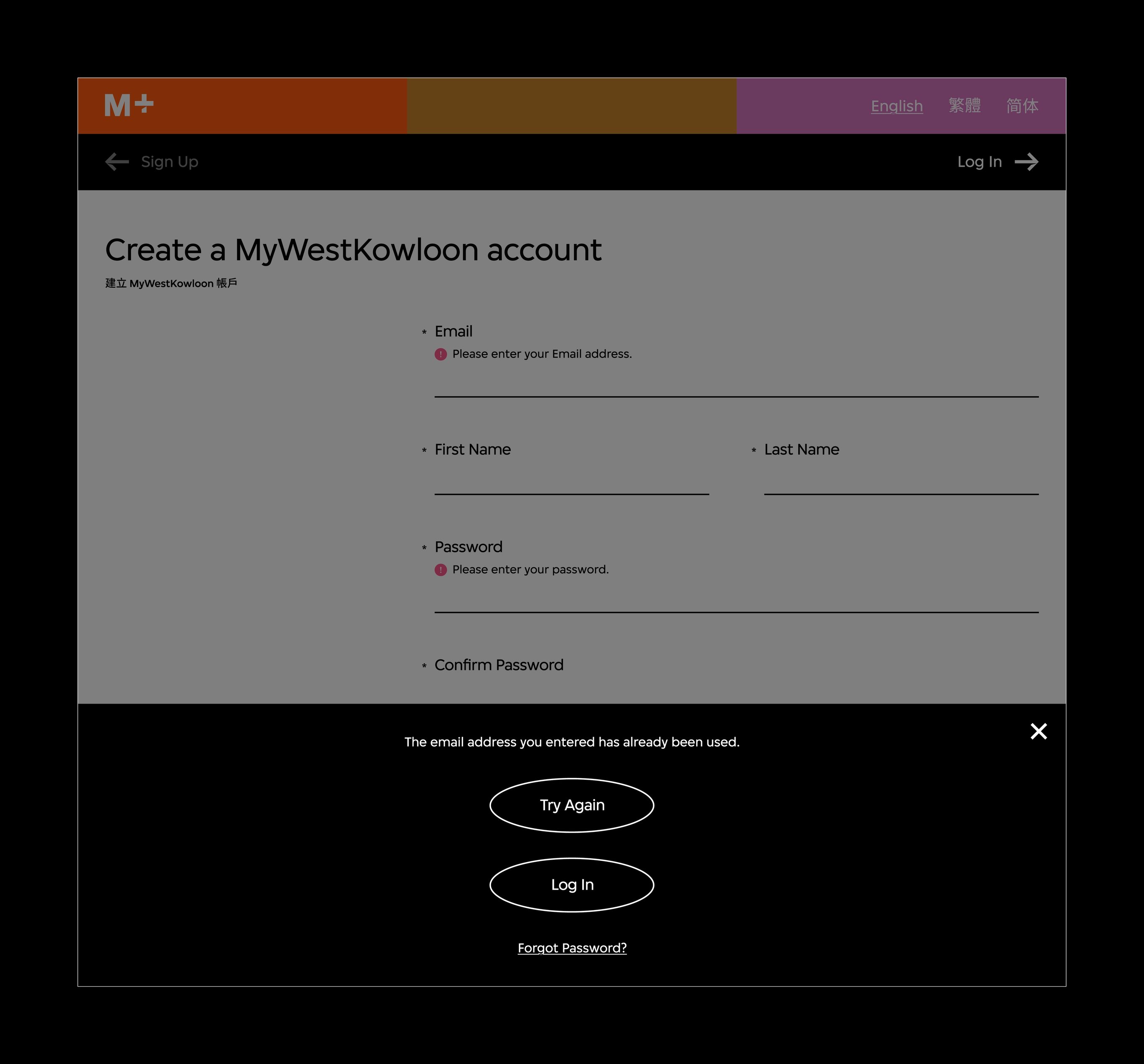
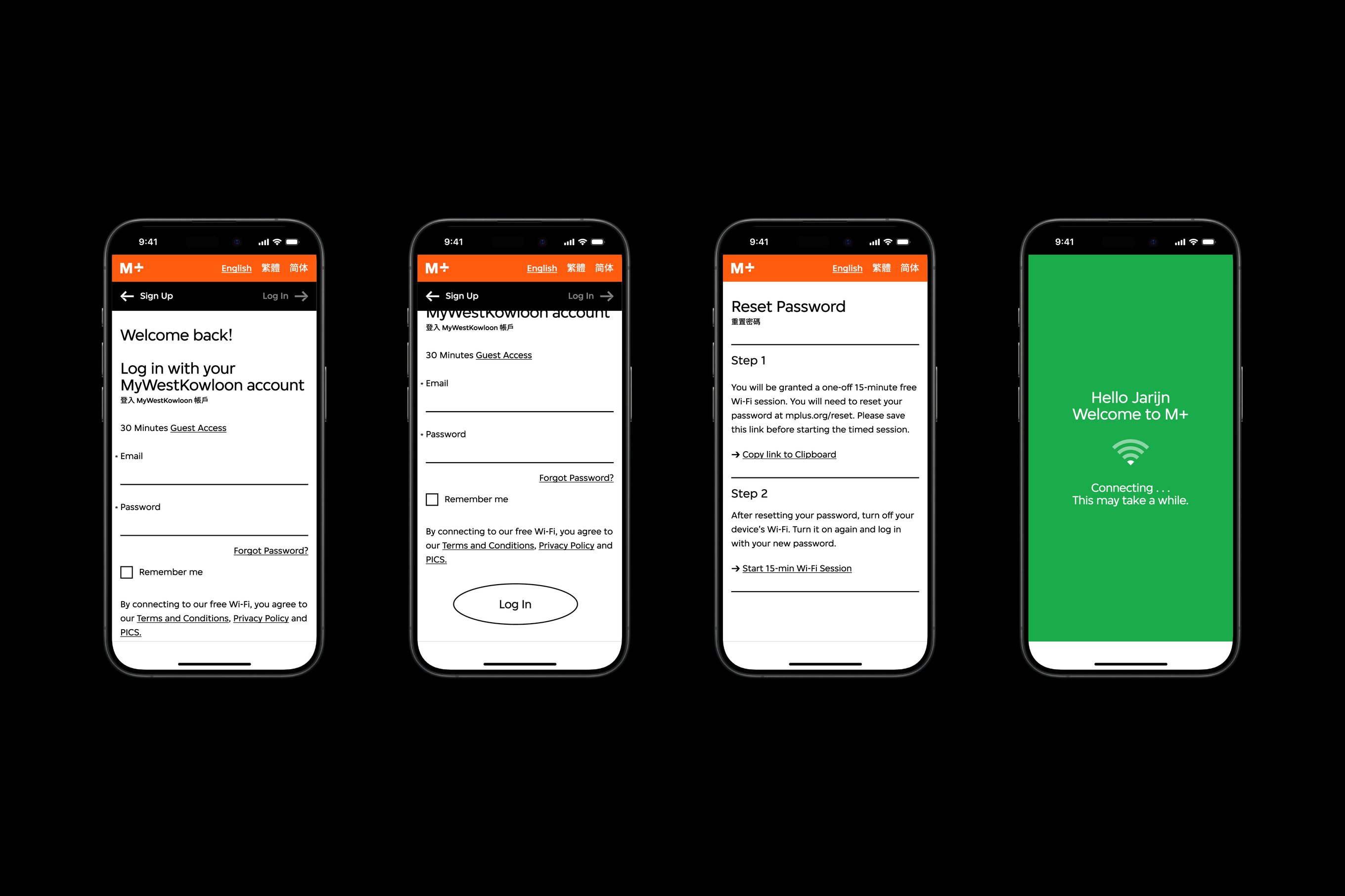
Pink icons indicate incorrect inputs or missing fields. A secondary menu under the language selection options allows visitors to navigate to their chosen section conveniently.
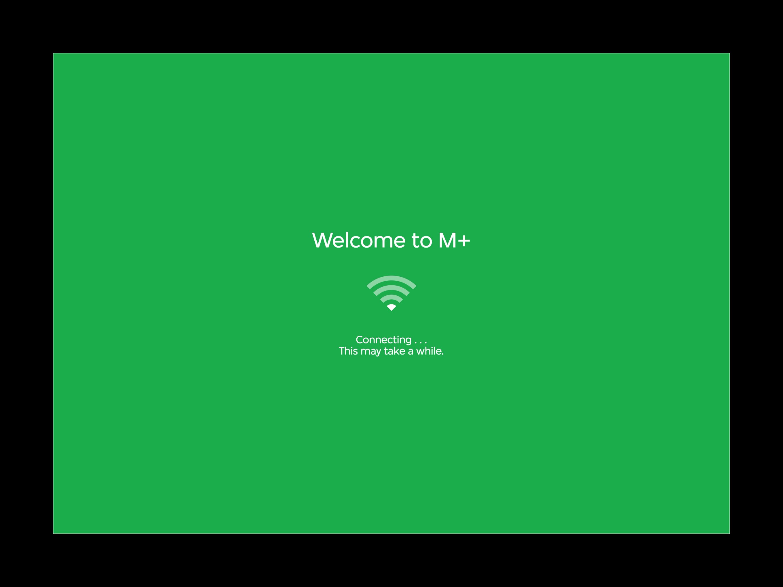
To contrast with the predominant tri-coloured interfaces, we applied a solid green background to the loading page to convey a sense of progression, accompanied by text, icons, and animation.
The M+ Visitor Wi-Fi User Interface project was led by Nic Chan, with Jimmy K.K. Lam of Studio Earth, Jarijn Nijkamp, and the Digital and Editorial Content team at M+.