M+ Online Exhibition Brochure

A flexible editorial template designed for dynamic layouts

M+, a preeminent museum in Hong Kong, houses an interdisciplinary and transnational collection of visual art and cultures. The museum strives to continuously enhance the audience experience to supplement their ever-expanding collections and ways of seeing.

Studio Earth designed a digital brochure template that complements the museum’s collections, providing accessibility to an audience of diverse backgrounds and abilities. At the same time, the template accommodates M+ design team’s shifting needs for future exhibitions.

Team

Studio Earth on user experience and layout design direction


Visual Art, and Digital and Editorial Content at M+

Julee Chung, Olivia Chow, William Smith, Yuling Zhong
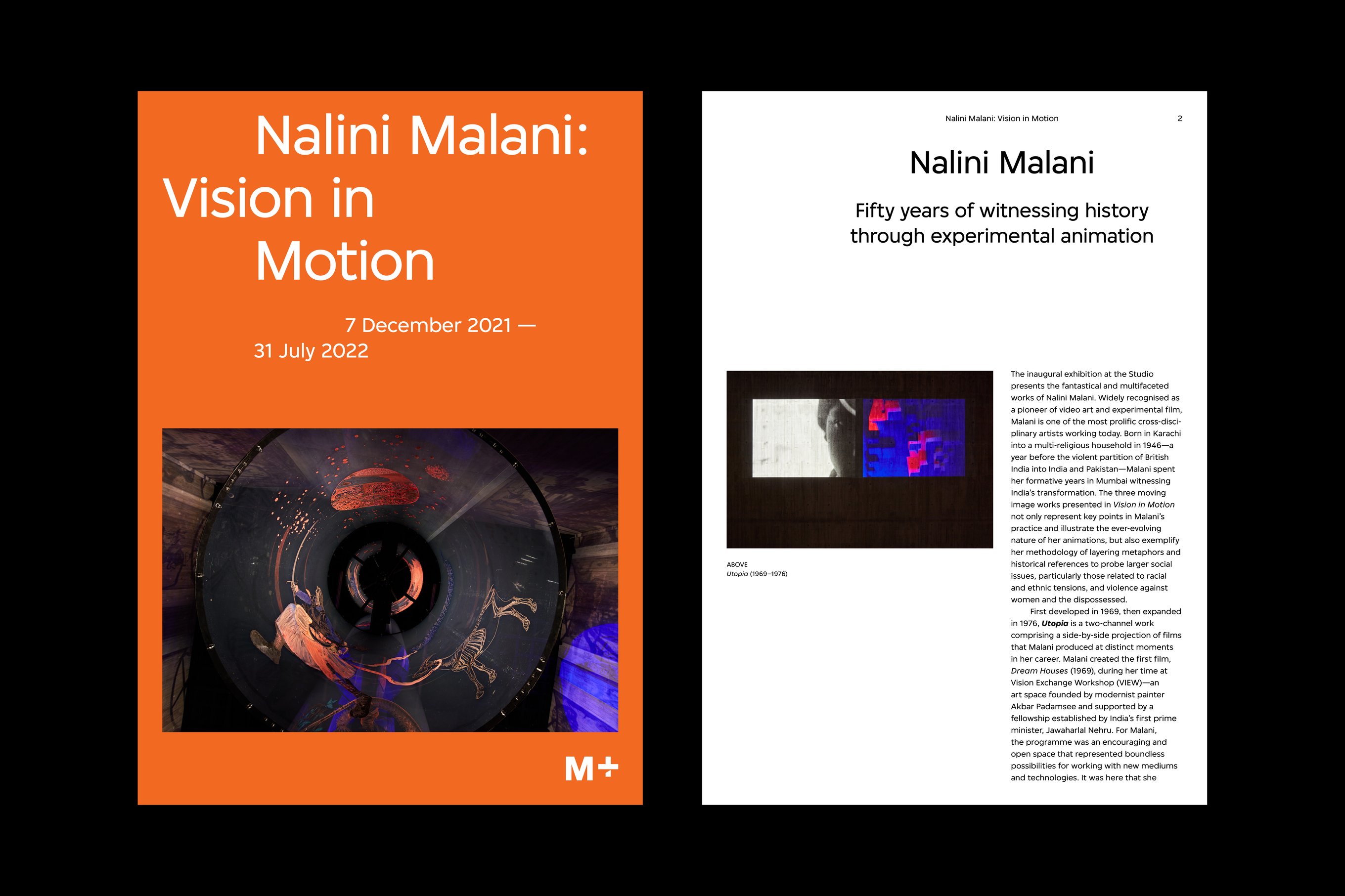
Cover and essay page design for the Nalini Malani exhibition brochure.
Studio Earth designed a digital brochure template with dynamic layouts that adhere to the M+ visual identity.

As Asia’s first global museum of contemporary visual culture, M+ aims to establish new standards for both the exhibitions and the visitor experience. With an ever-expanding collection, evolving accessibility standards, and increasing understandings of visitor pain points, M+ continues to explore designs that optimise the museum experience.

M+ commissioned Studio Earth to develop a digital brochure for contemporary artist Nalini Malani’s exhibition. The brochure will be used as an archetype to further its dual objectives of going paper-free and to create a sustainable, seamless and accessible experience for all visitors.

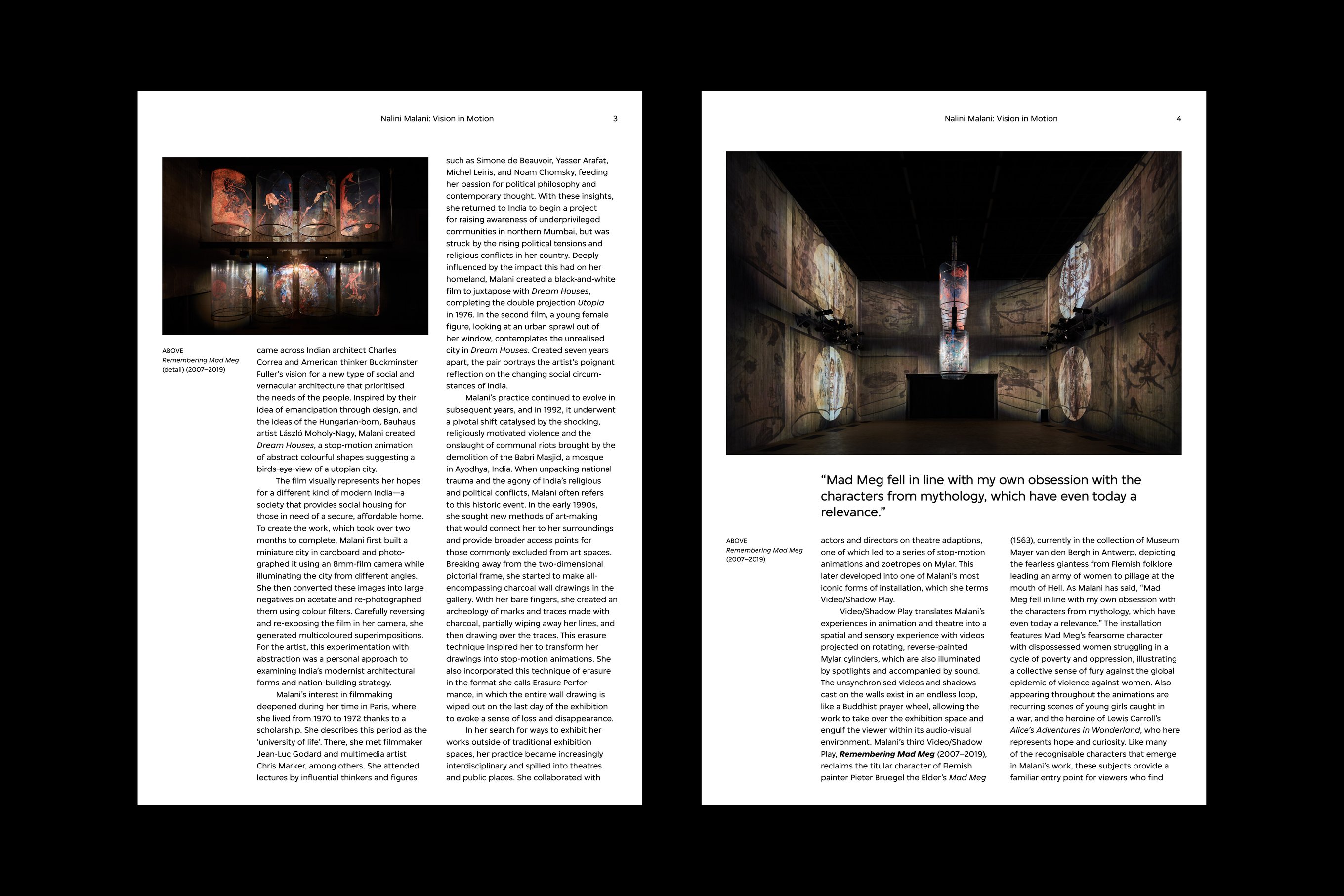
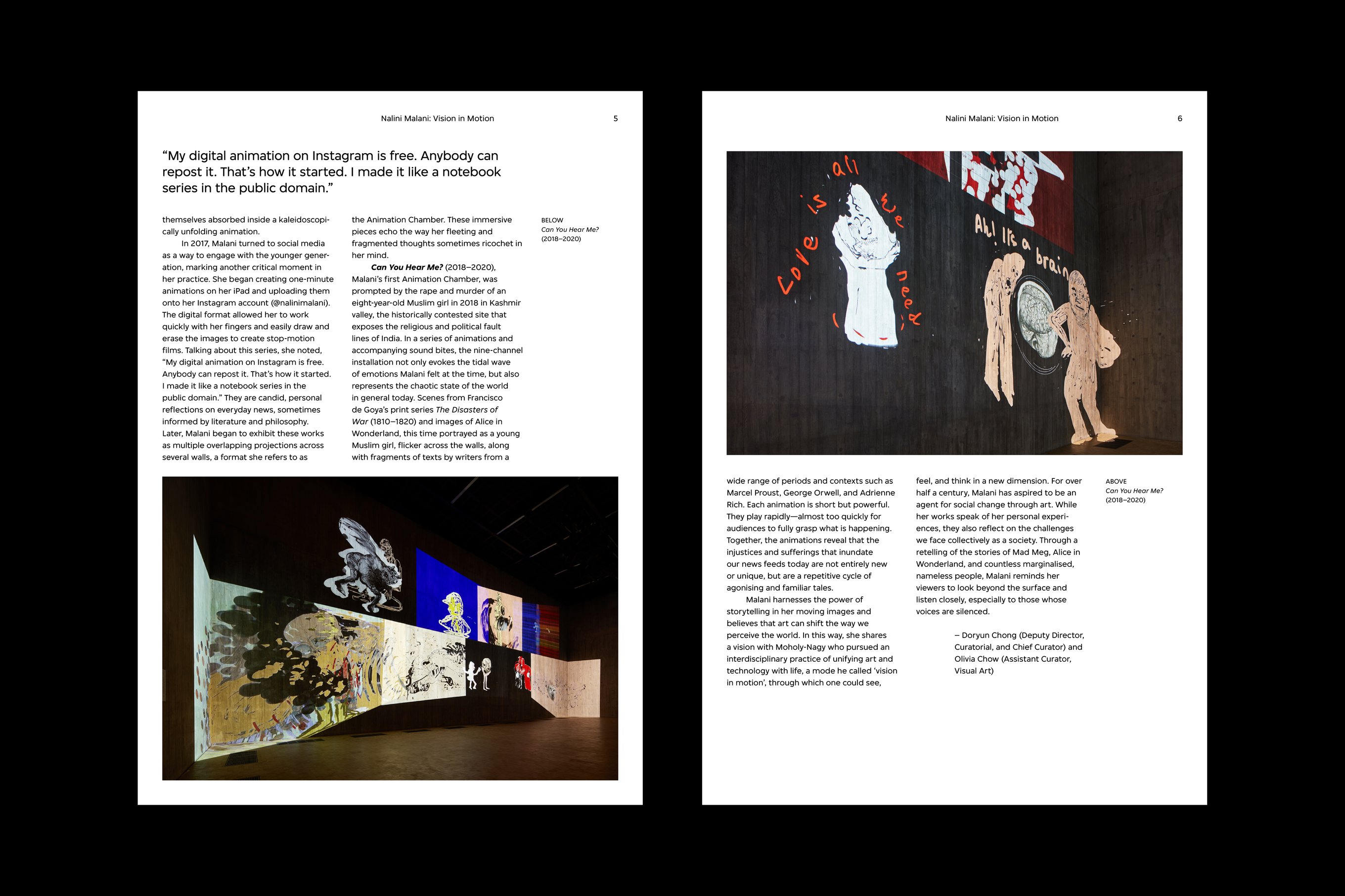
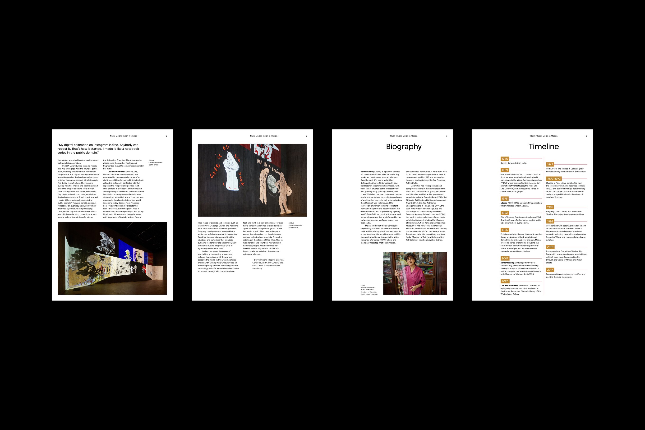
Essay page designs for the Nalini Malani exhibition brochure with images, captions, and pull quotes.
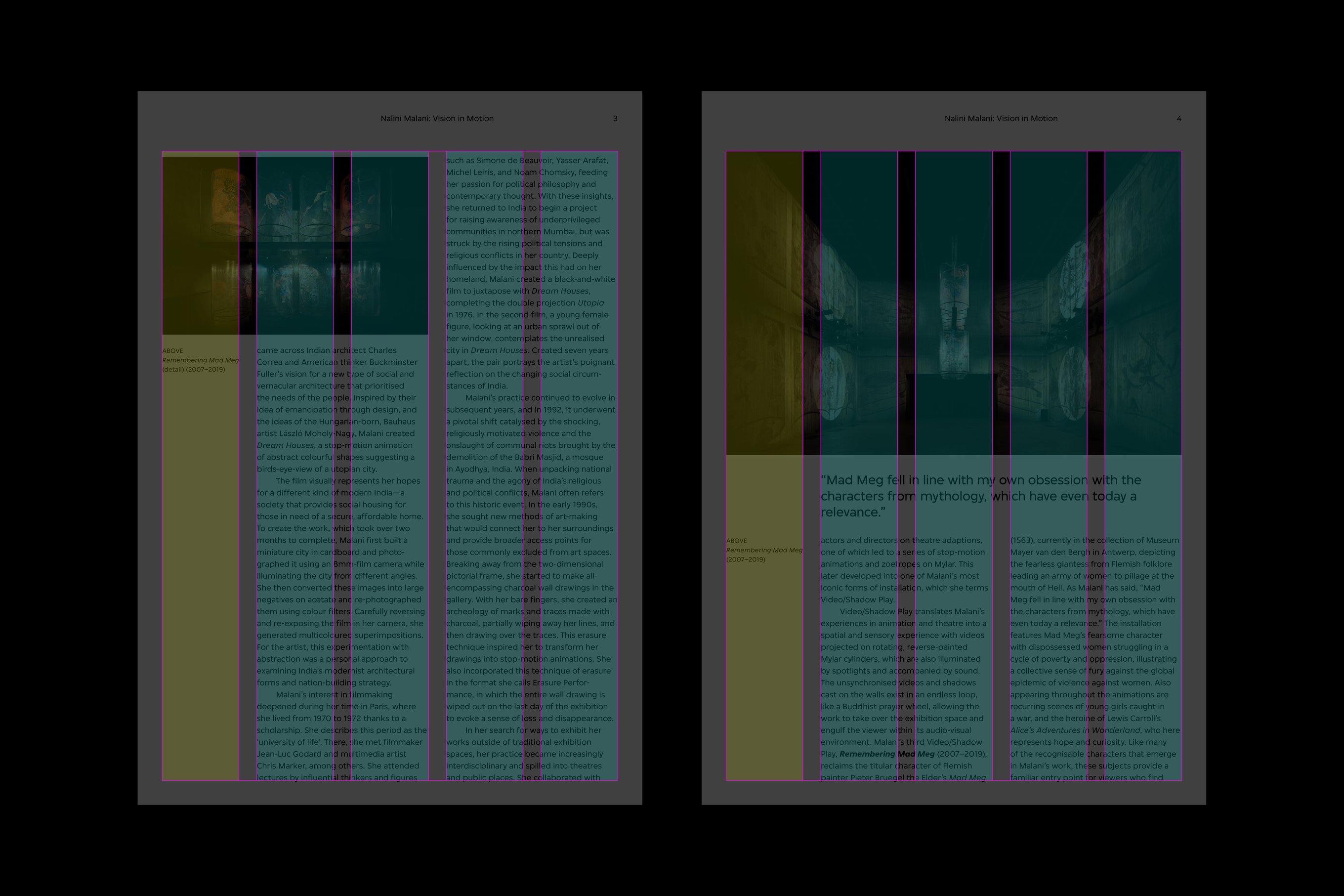
Essay page designs for the Nalini Malani exhibition brochure with a graphical representation of the five-column grid system.
The template’s layout follows a five-column grid system to ensure visual consistency and adaptability.

M+ visitors encompass a variety of demographics and have a wide range of experiences when engaging with artworks. The brochure needs to read well on both smartphones and computer monitors without inundating visitors with unnecessary information.

The in-house team will also need to refer to this brochure for future exhibitions, which prompted us to create an adaptable template. To meet these goals, we designed the digital brochure with two different users in mind: the M+ visitors and the M+ in-house design team.

Essay page designs for the Nalini Malani exhibition brochure with images, captions, and pull quotes.
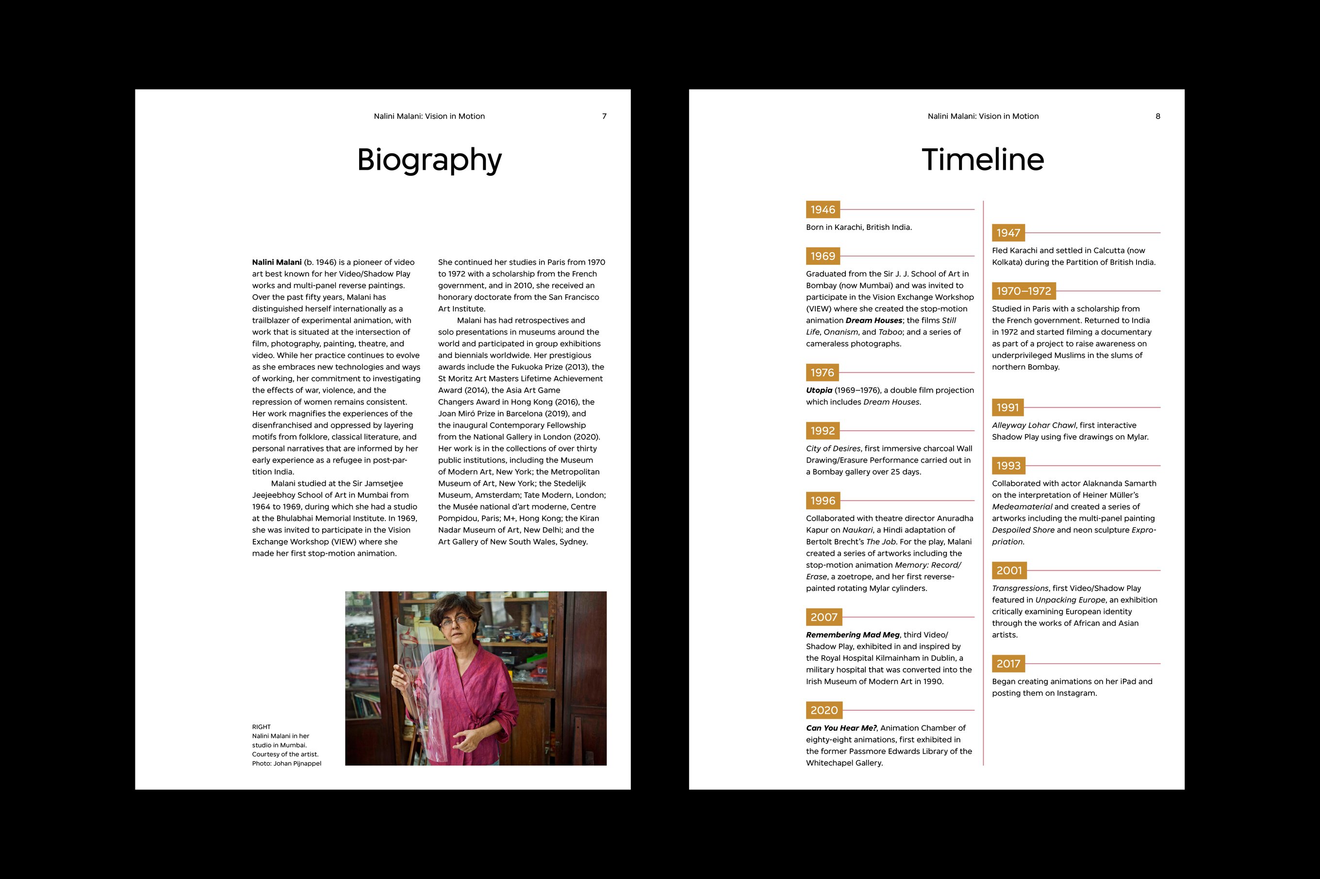
Dynamic text placements for the biography and timeline page demonstrate adaptation flexibility.
Biography and timeline page designs for the Nalini Malani exhibition brochure.
Various text placements for the biography and timeline page demonstrate adaptation flexibility.

Museum user experience research from M+ notes how differing interest levels in artworks shaped the visitor’s engagement with exhibition guides. The Nalini Malani digital brochure was designed for simple and quick access with a clear visual hierarchy.

Key information is placed at the top for visitors to glance at with minimal effort, and one could keep reading the first few paragraphs for some more context. For those desiring further details, the full text sits in the following page.

This brochure was designed to make the most commonly sought-after information quickly visible and accessible through captions and bylines around the main body of the comprehensive essay on the artwork, fulfilling the needs and interest levels of all visitors.

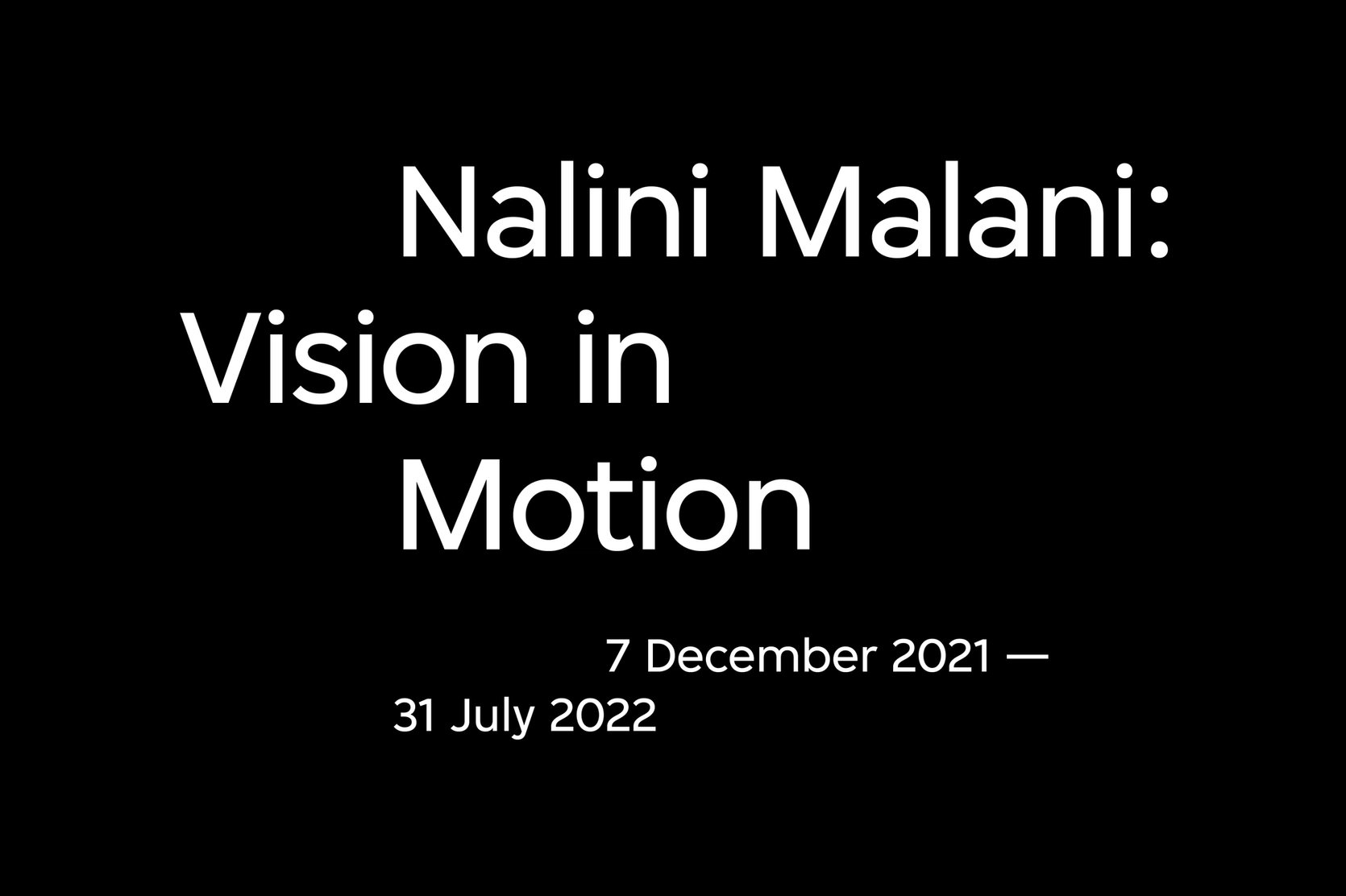
A typographical representation of the title and date formatted for the Nalini Malani exhibition brochure.
Header and the exhibition date font sizes demonstrate the importance of contrasts that create visual hierarchies.
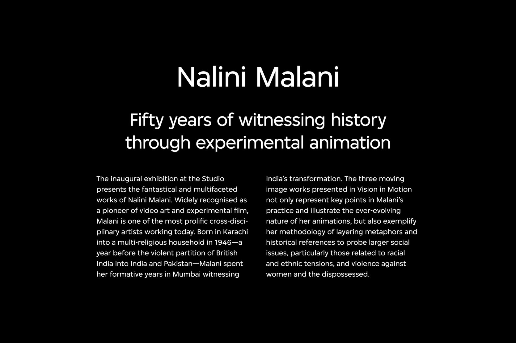
A typographical representation of the heading, subheading, and body text formatted for the Nalini Malani exhibition brochure.
A custom sans-serif font is used throughout the layout template to maintain the visual consistency.

To create a template the M+ design team can rely on, Studio Earth studied their content requirements and visual branding to create a highly flexible yet functional grid and typesetting system, with templates for the cover, artist biography, essay, and timeline pages. We also built extensions that would enable variable image or text-heavy applications.

The grid system centred around three main categories — titles, images and body text — which dictate their placement on any given page to ensure consistency throughout all future digital brochures.

The typesetting structure involved categorising texts as title, body, caption, byline, and pull quote, and their respective font sizes were assigned to ensure legibility and cohesion standards within the M+ identity guideline. The layouts also accommodate text in English, Traditional and Simplified Chinese.

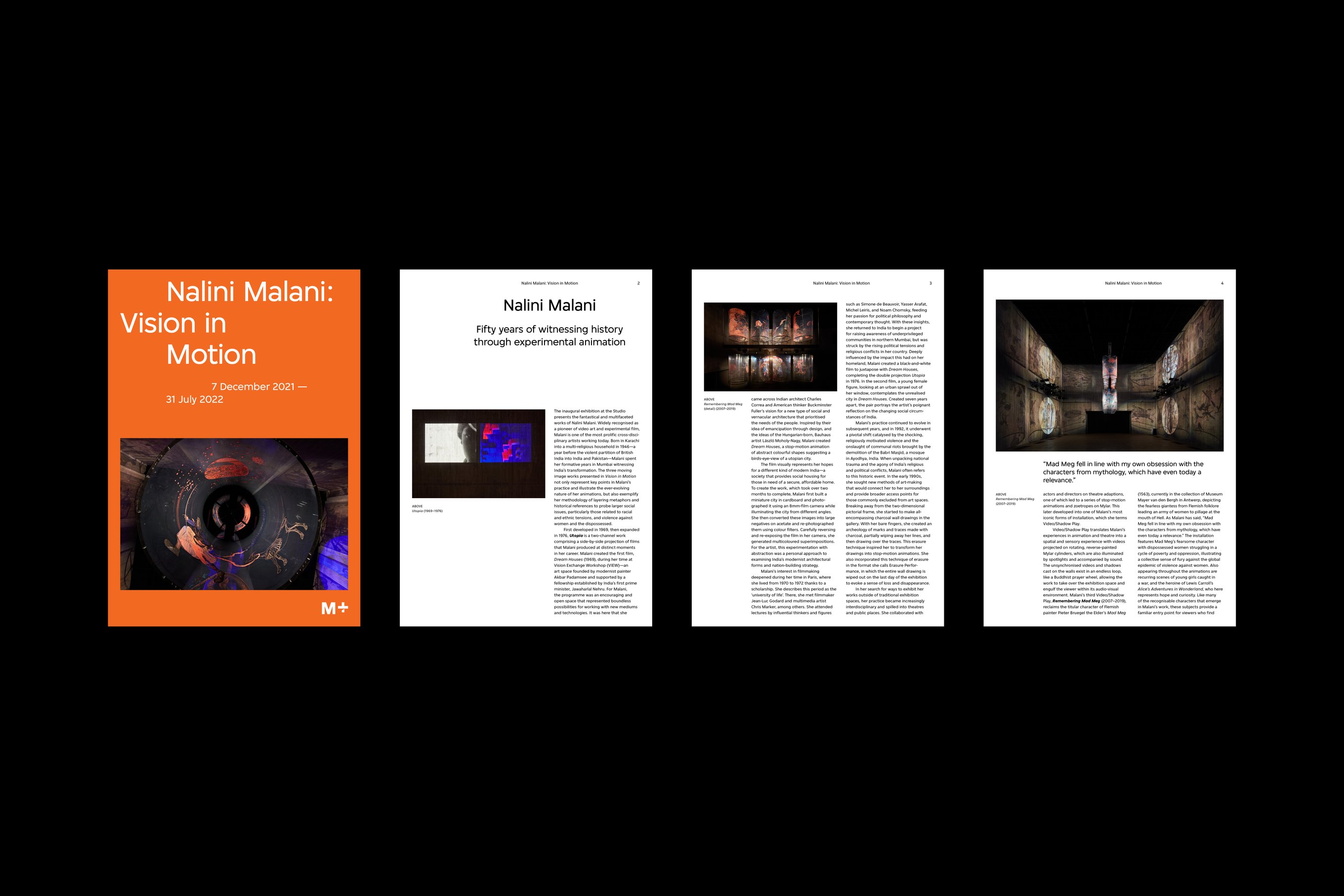
An overview of the Nalini Malani exhibition brochure, including the cover and three essay pages accompanied by images and texts.
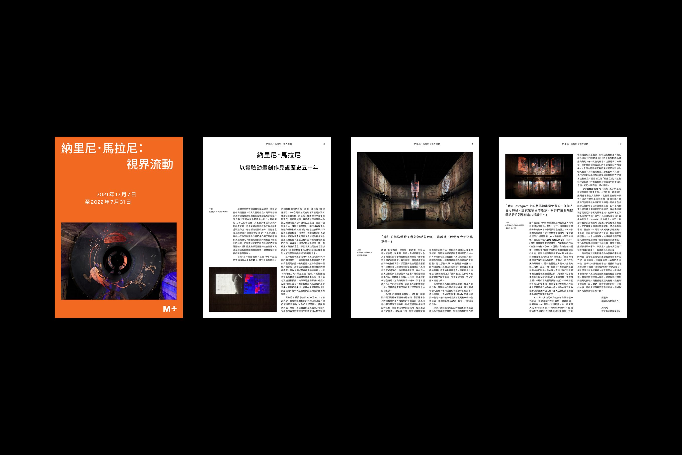
The grid system flexibly accommodates varying layouts shown in Traditional and Simplified Chinese versions.

This project’s user experience and layout design direction was led by Jimmy K.K Lam from Studio Earth with Julee Chung, Olivia Chow, and Yuling Zhong at M+.

This case study was written by Rebecca Isjwara and Izumi Nakayama.

Back