M+ Audio Guide

An accessible and holistic museum experience

M+ is one of the leading global museums of visual culture and home to a vast collection of works representative of Chinese and Asian art, design, and architecture.

To improve the museum experience, M+ enlisted Nic Chan, Jimmy K.K Lam from Studio Earth, and Jarijn Nijkamp to design and develop a progressive web app (PWA) to serve as the audio guide.

As a team, we developed a personalised platform that enhances the visitor experience with numerous ways to access the museum collection based on personal interests and preferences.

Team

Nic Chan on development, Jimmy K.K Lam from Studio Earth on user experience and interface design, and Jarijn Nijkamp on user experience research and project management


Digital and Editorial Content, and Learning and Interpretation at M+

Catherine Erneux, Claudia Tsang, Kingsley Man, Keri Ryan, Nicholas Leung, William Smith, Winnie Lai
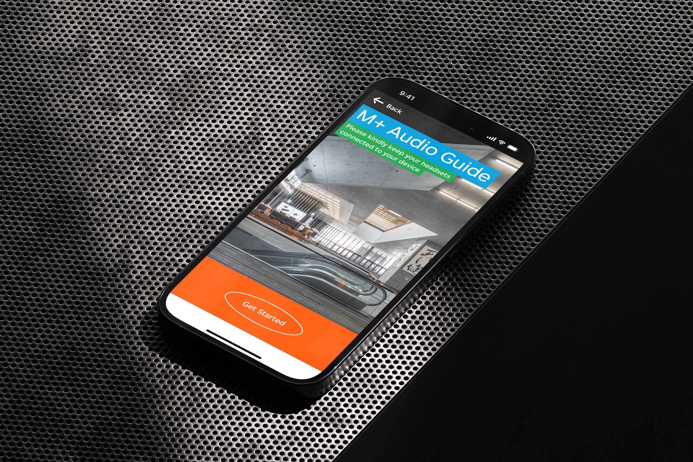
The M+ Audio Guide start up interface on an iPhone 14 Pro's screen.
A progressive web app (PWA) uses progressive enhancement to provide users with a more reliable experience.
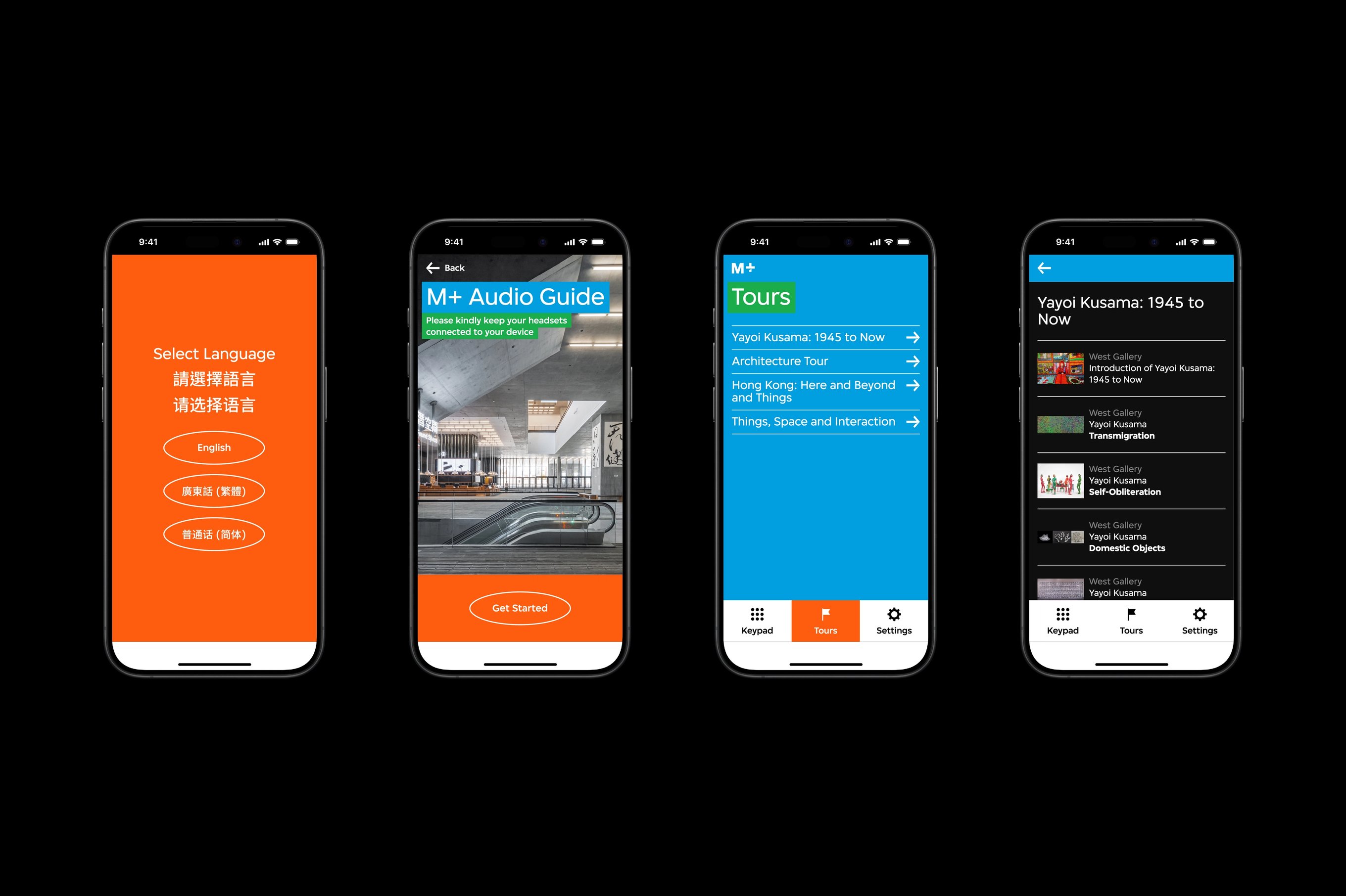
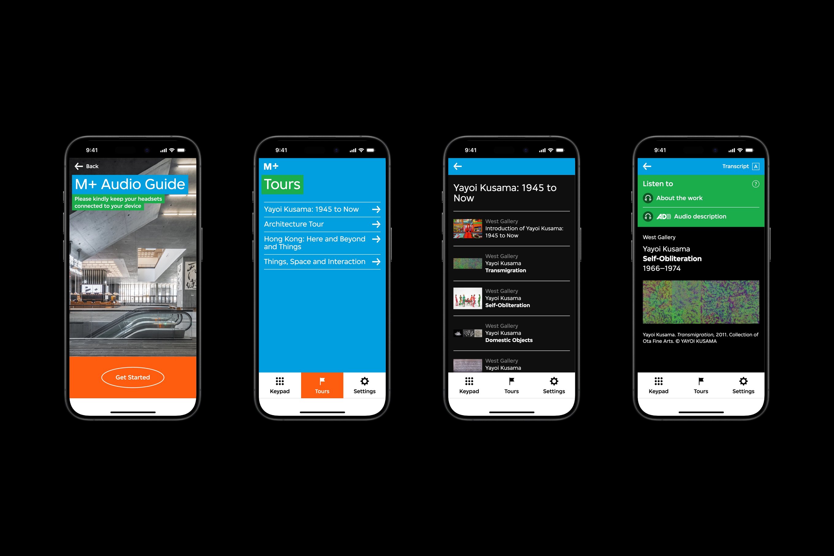
There are three audio guide interfaces. The first interface features the start-up page with three options. The second interface features the tours overview page, and the third interface features the artwork page.
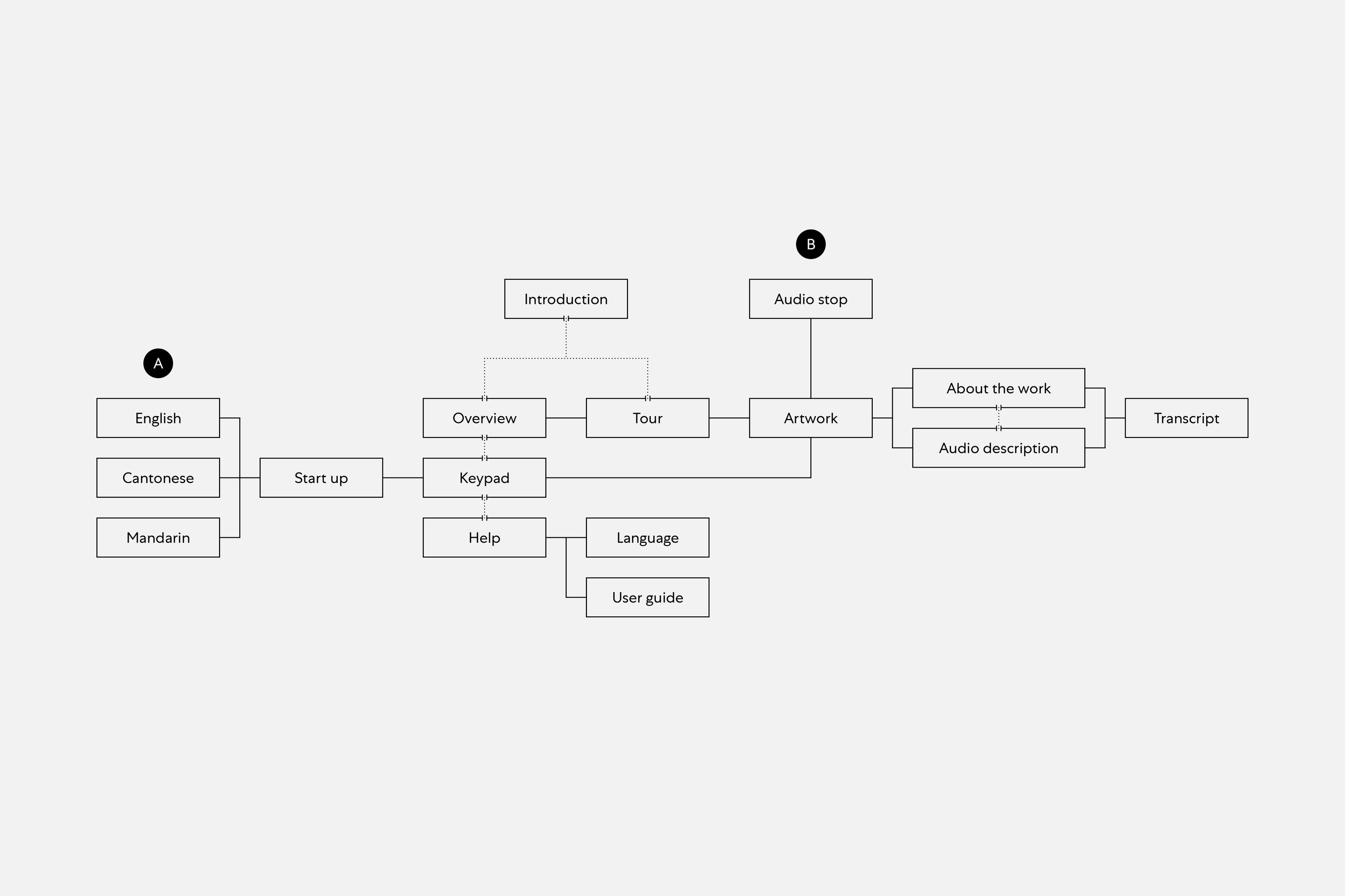
A flow chart of the audio guide featuring two user flows that intertwine with each other and form a complete journey.
Visitors can activate the audio guide either from the start-up page or an audio stop.

Audio is a personal and effective medium for the museum to complement its vivid collections. Hence, we aim to provide comprehensive facts and commentary on each piece from the collection that are accessible throughout the museum experience.

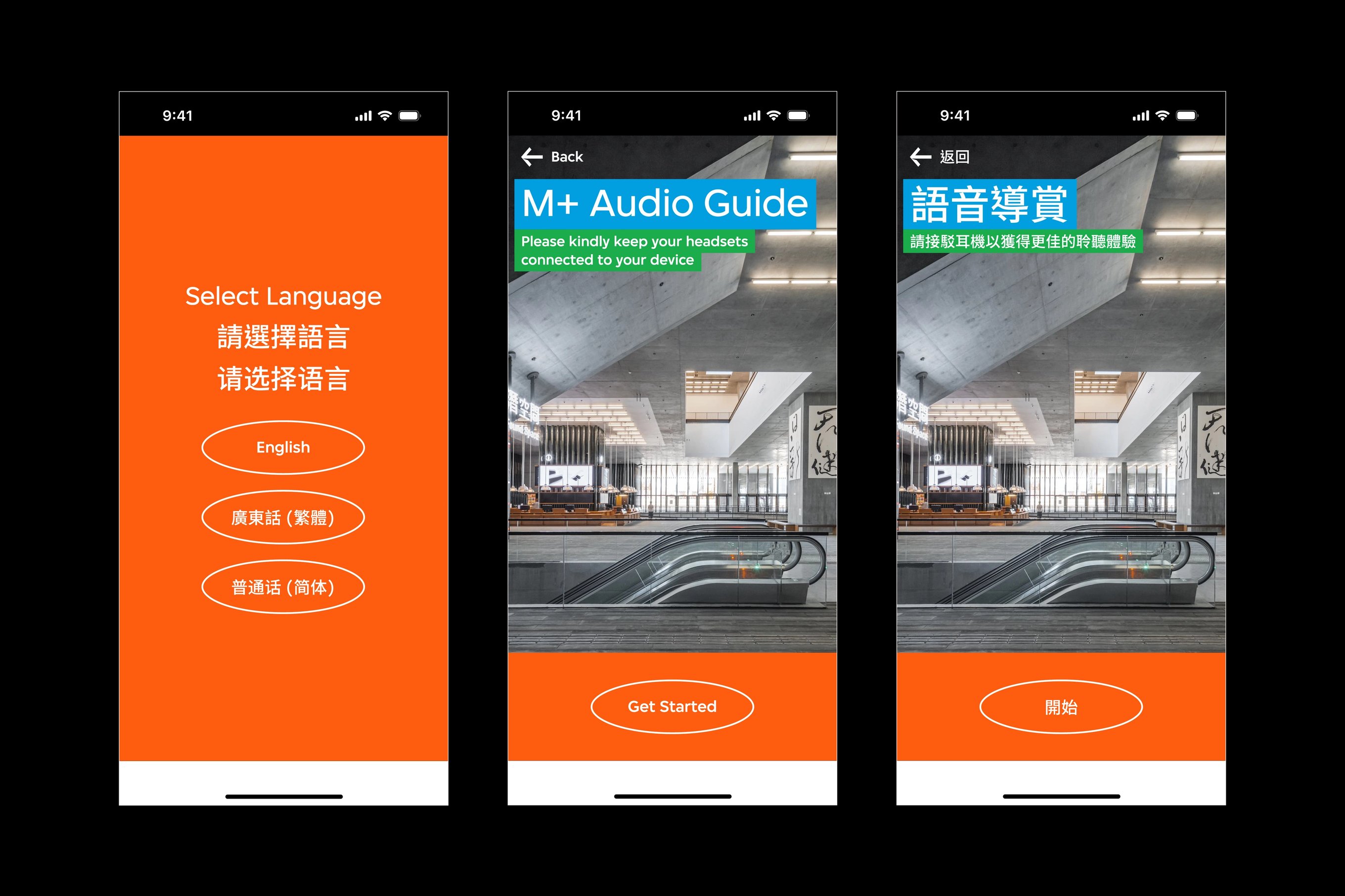
There are three audio guide interfaces. The first interface features the language selection page with three options. The second and third interface features the start-up screen in English and Traditional Chinese.
The start-up page directs visitors to select their preferred language, which leads to the audio guide’s homepage.
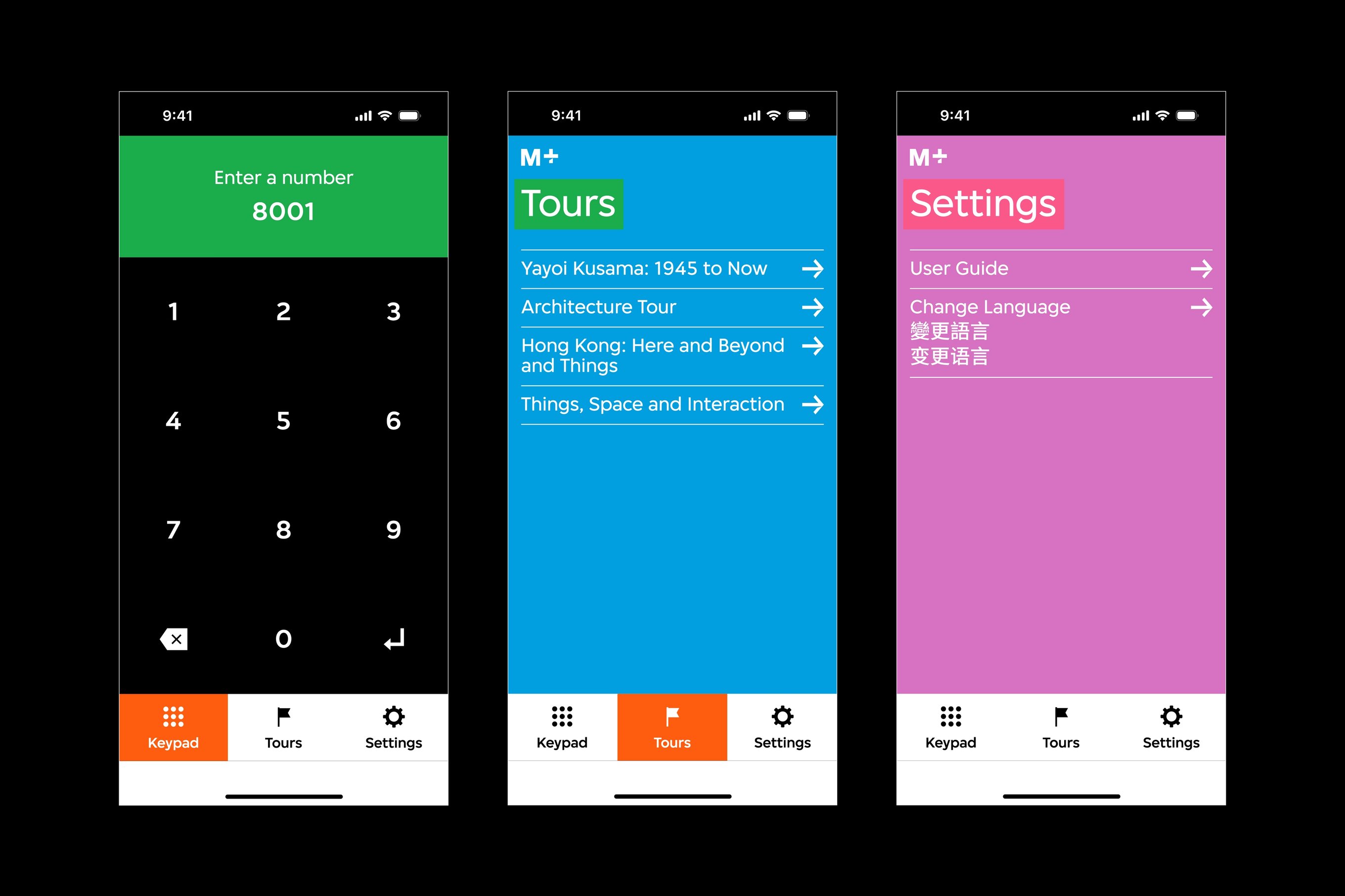
There are three audio guide interfaces. The first interface features the keypad page. The second interface features the tours overview page, and the third interface features the settings page.
“Keypad,” “Tours,” and “Settings” are fixed at the bottom of the screen for visitors to navigate throughout their experience.

The PWA employs familiar and intuitive user interactive patterns as its foundation. Three main functions — “Keypad,” “Tours,” and “Settings” — are fixed at the bottom of the interface, where visitors can conveniently toggle between them.
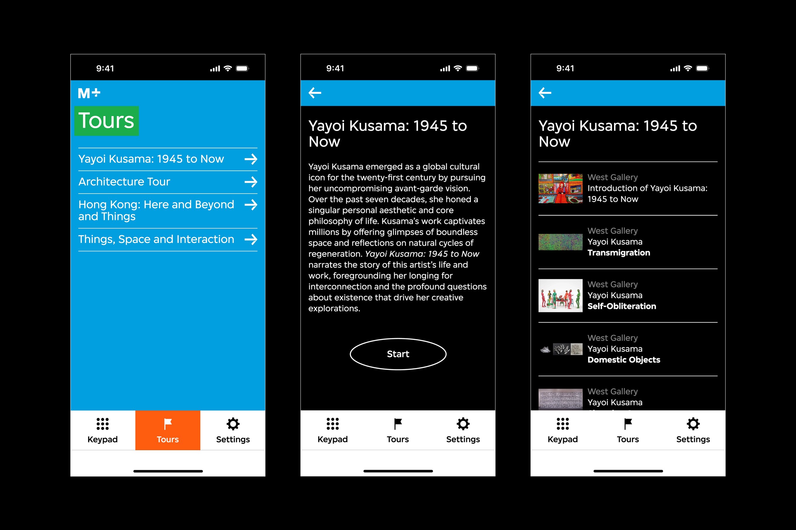
There are three audio guide interfaces. The first interface features the tours overview page. The second interface features the exhibition introduction page, and the third interface features an exhibition overview page.
An introduction page for special exhibitions will appear before the “Tour” overview page.
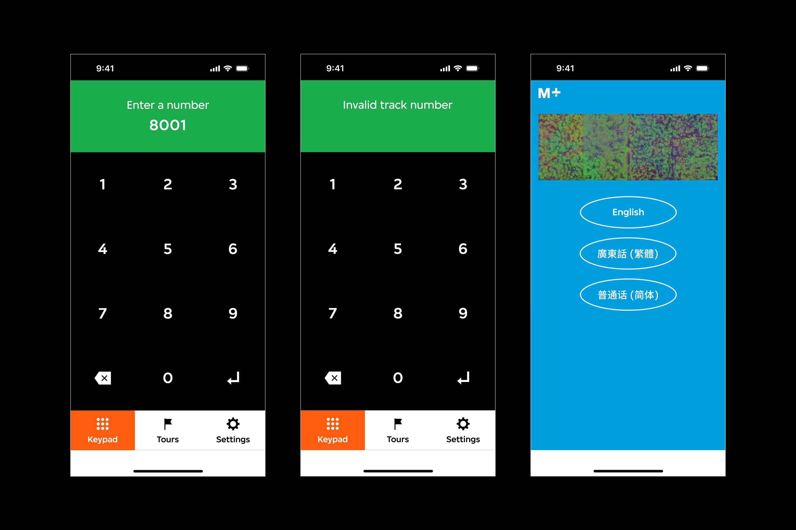
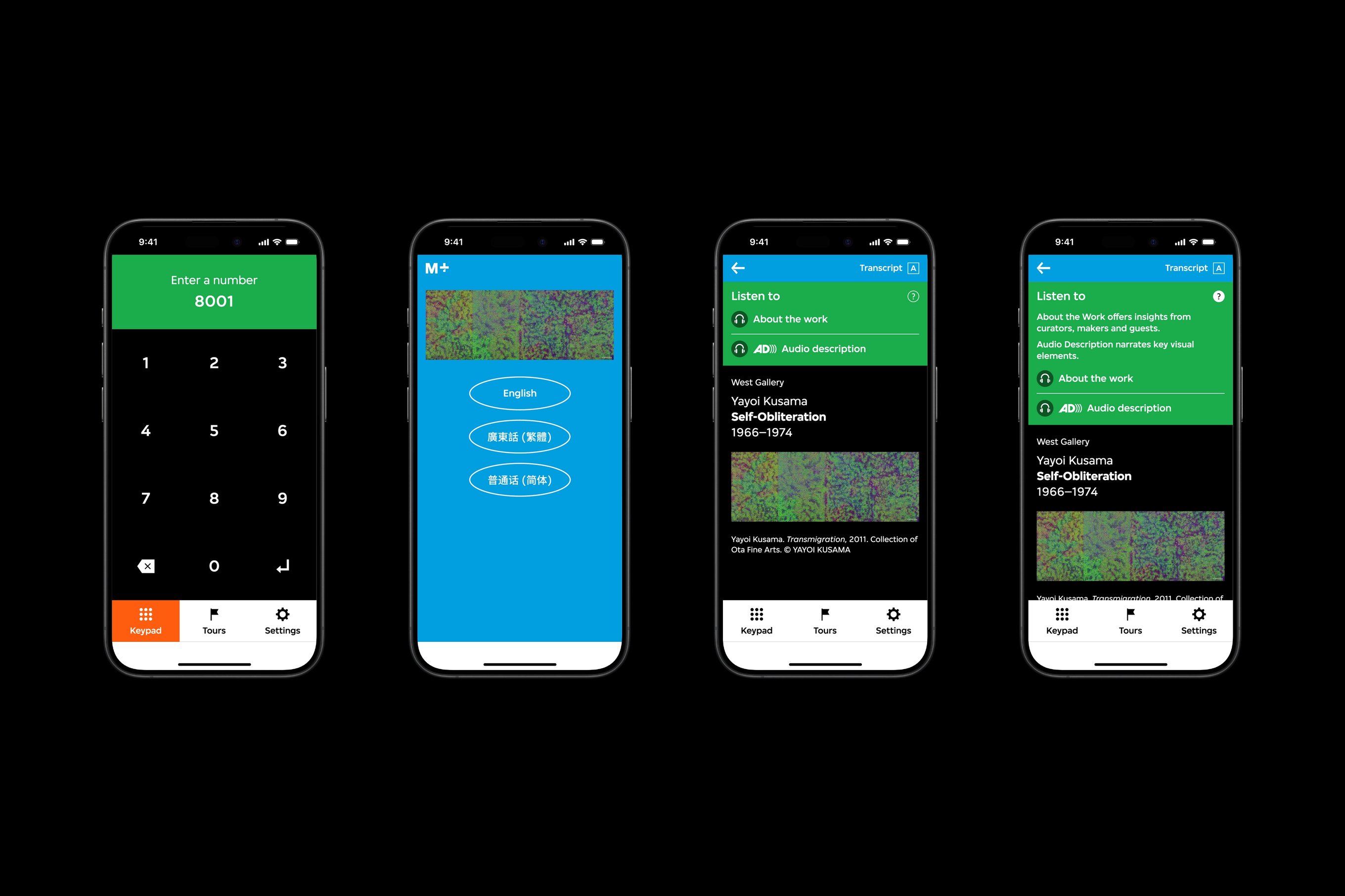
There are three audio guide interfaces. The first interface features the keypad page. The second interface features the keypad page with an error message, and the third interface features an audio stop page.
Entering an audio stop number on the “Keypad” will direct visitors to a language selection page with an image of the selected artwork.

Visitors can explore guided tours via the “Tours” page or access specific works via the keypad function. We developed these features based on the type and nature of the exhibitions.

Where most galleries invite visitors to explore freely, special exhibitions, such as “Yayoi Kusama: 1945 to Now,” propose specific pathways for a more holistic, narrative-based experience.

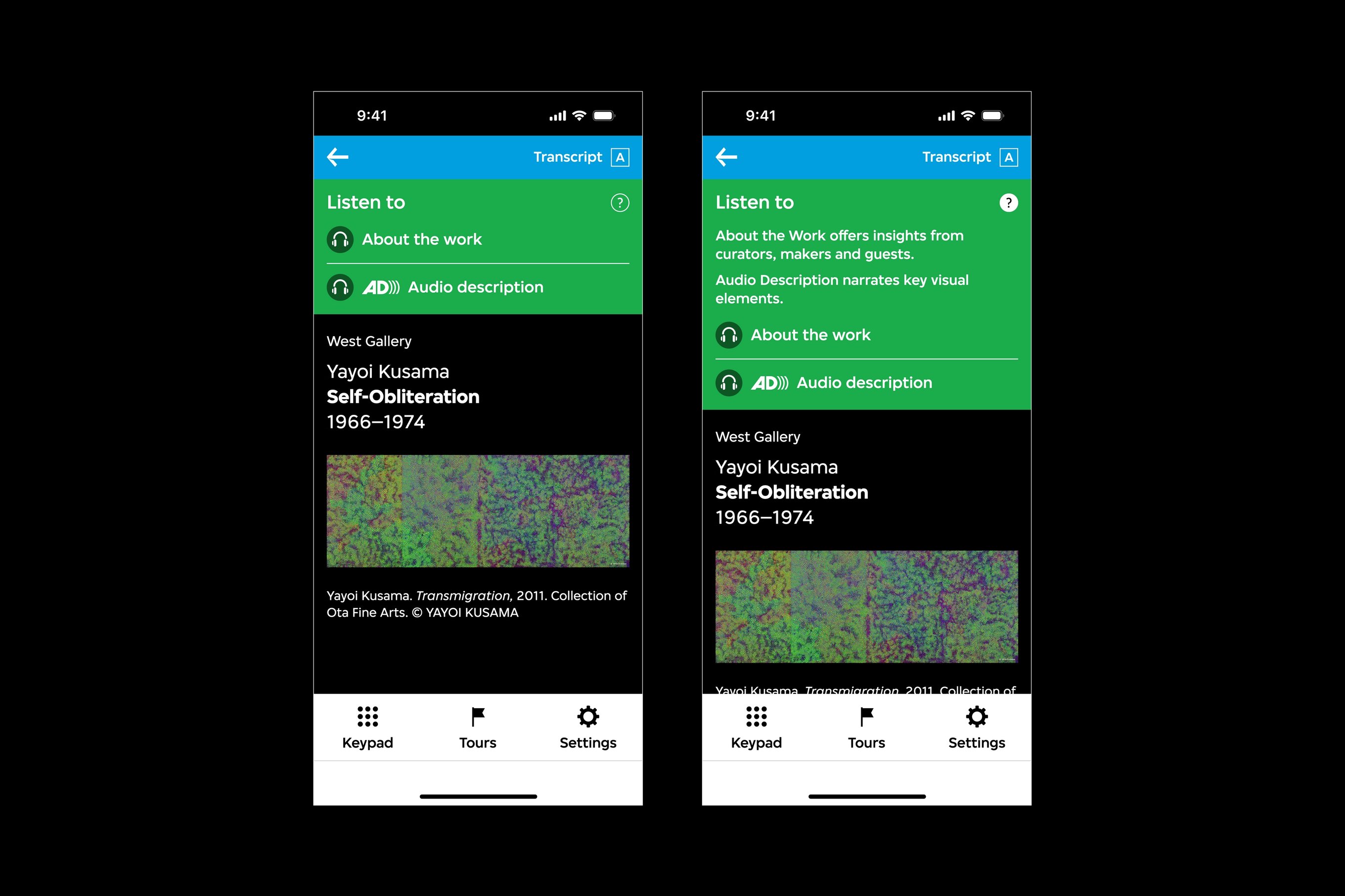
There are two audio guide interfaces. The first interface features a container for the about the work and audio description audio track options, and the second interface features a description of those options.
“About the work” offers insights from curators, makers and guests, whereas “Audio description” narrates visual elements of the work.
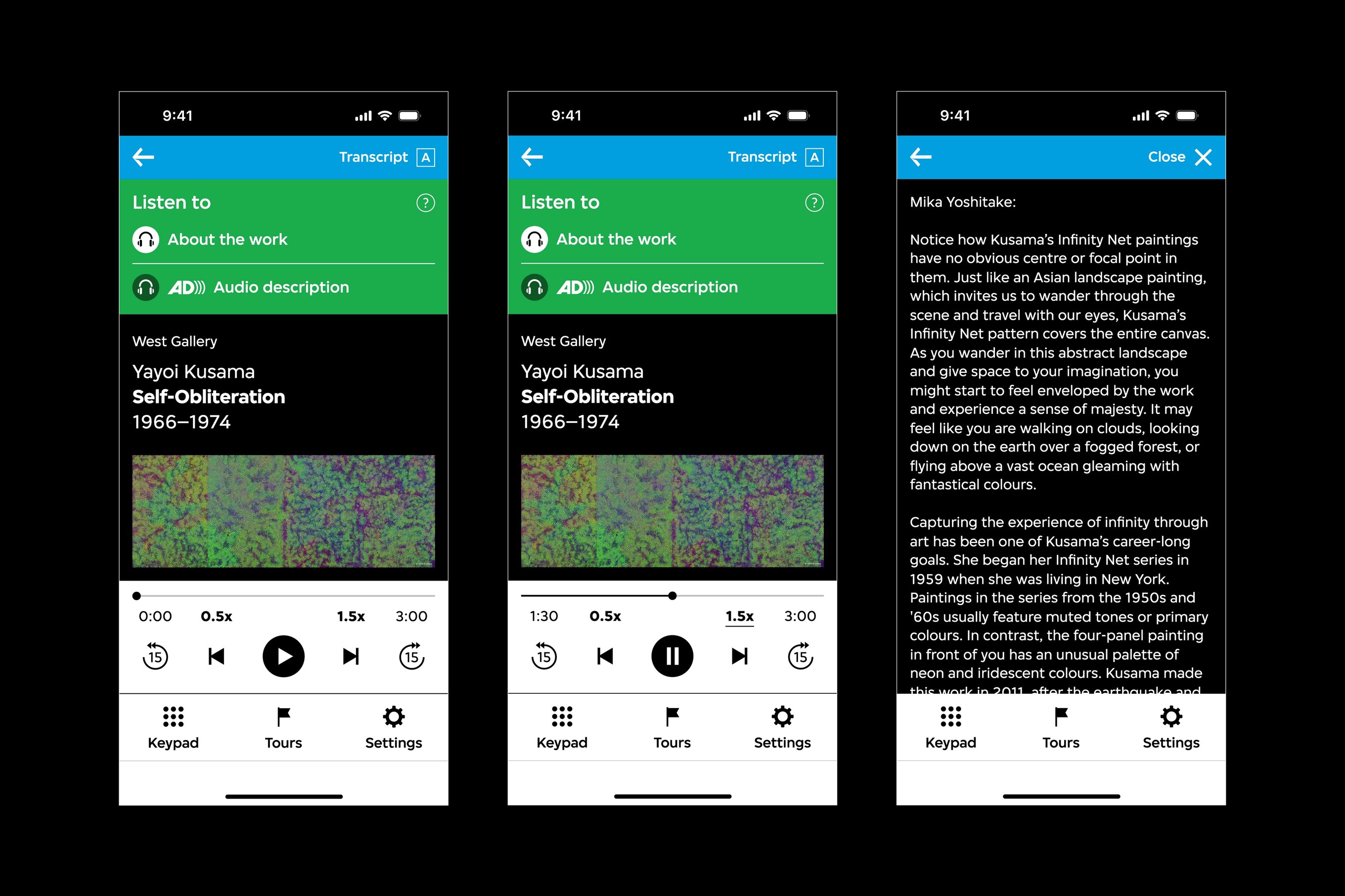
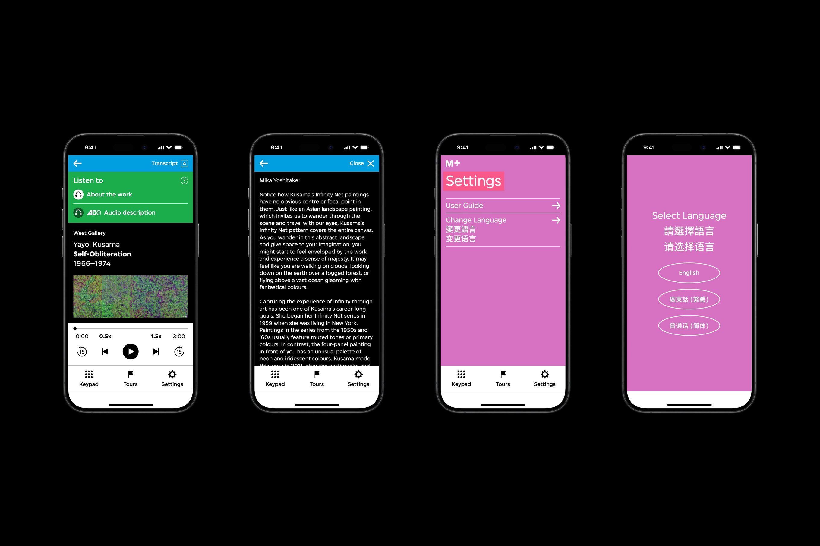
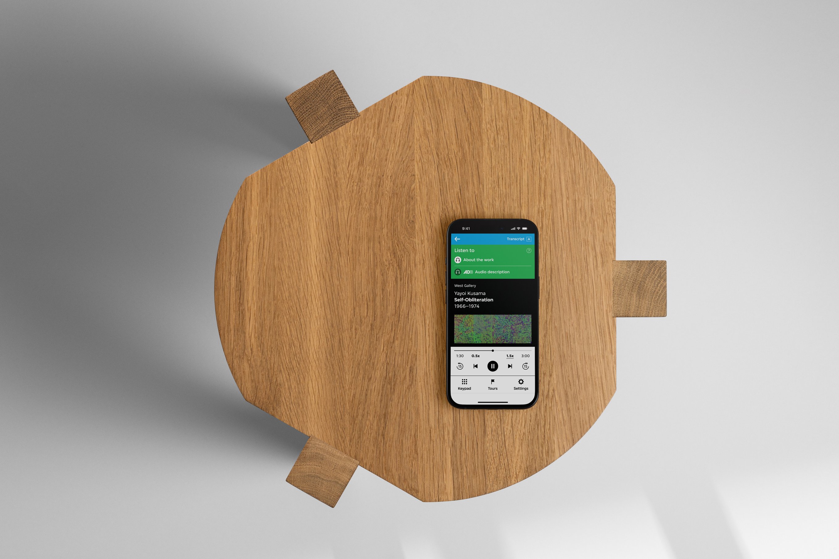
There are three audio guide interfaces. The first and second interface features an activated audio player interface at the bottom of the viewport, and the second interface features an audio track transcript.
Audio functions such as speed up, down, fast forward, and backwards can help visitors customise their experience based on their preferences.

We aim to create an all-inclusive interface based on visitor behaviours. Visitors have two options for accessing information about specific works: typing in the work number or scanning a QR code with their smartphone’s camera function.

Each piece of work consists of two audio clips — “About the work” provides extensive commentary on the work, and “Audio description” provides a brief description of the artwork. Visitors can also conveniently activate transcriptions of the selected audio clip.
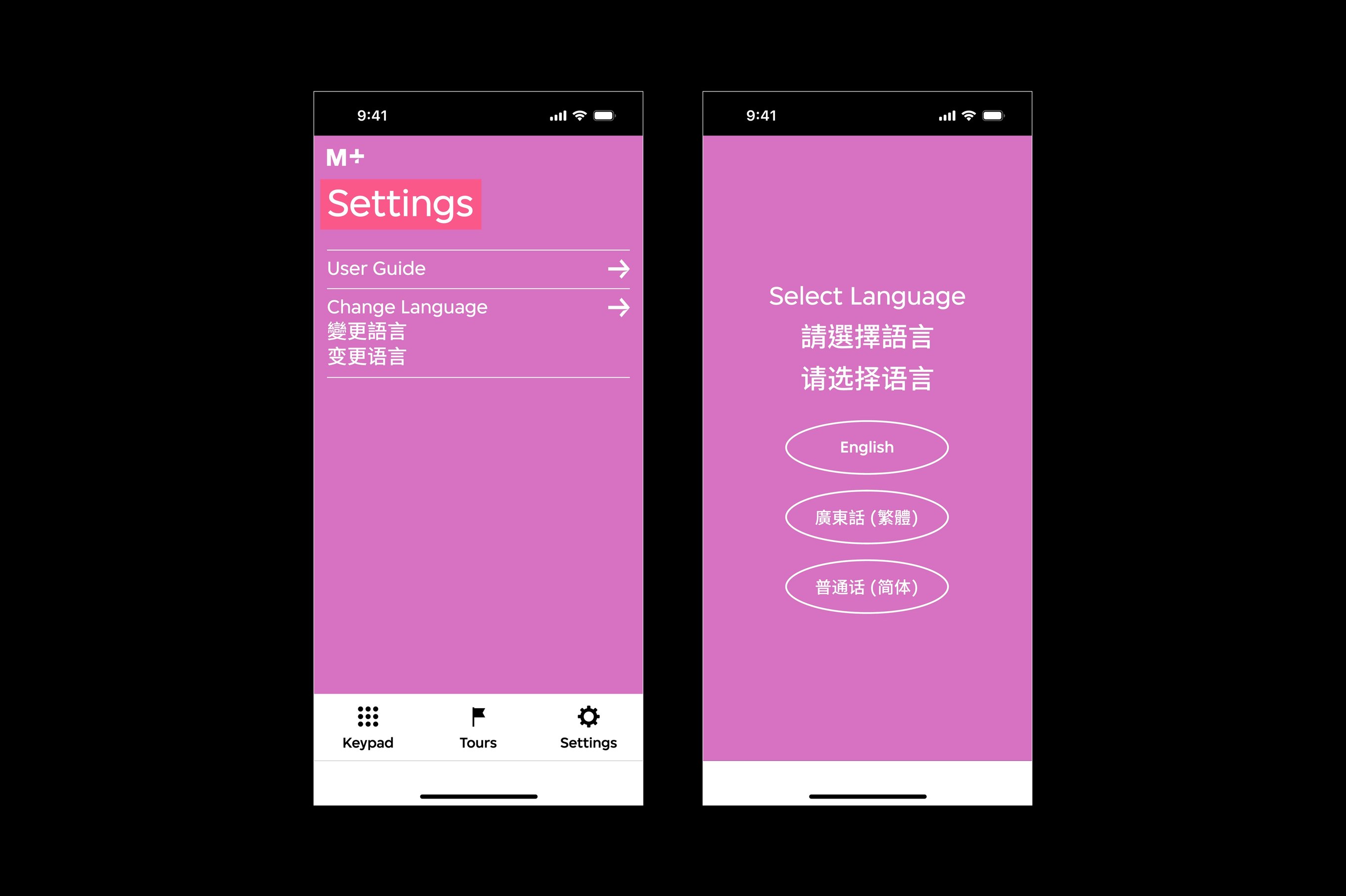
There are two audio guide interfaces. The first interface features the settings page, and the second interface features a language selection page accessed from the settings page.
Visitors can change the language of the audio guide at any point of their journey in the “Settings” tab.
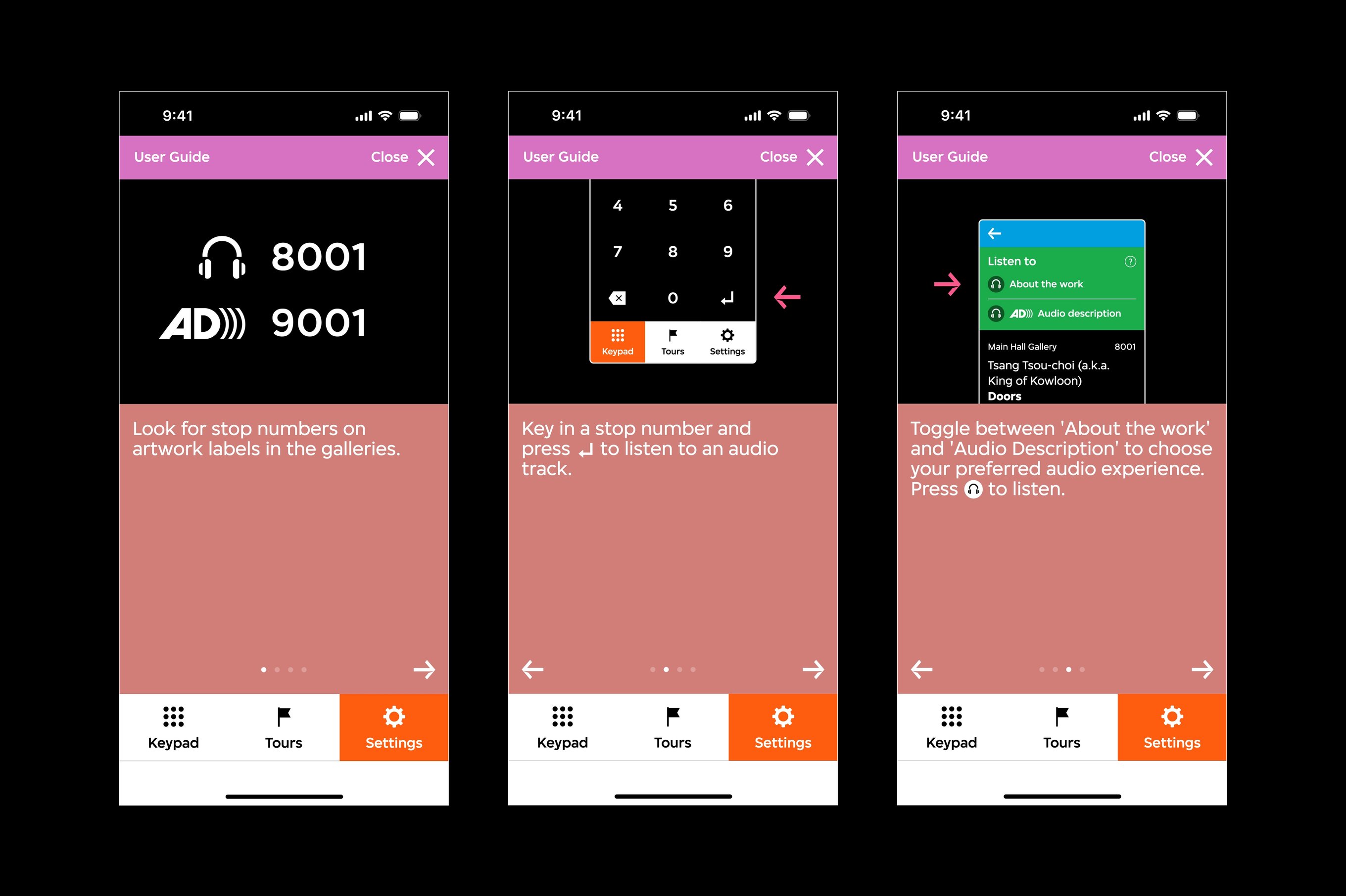
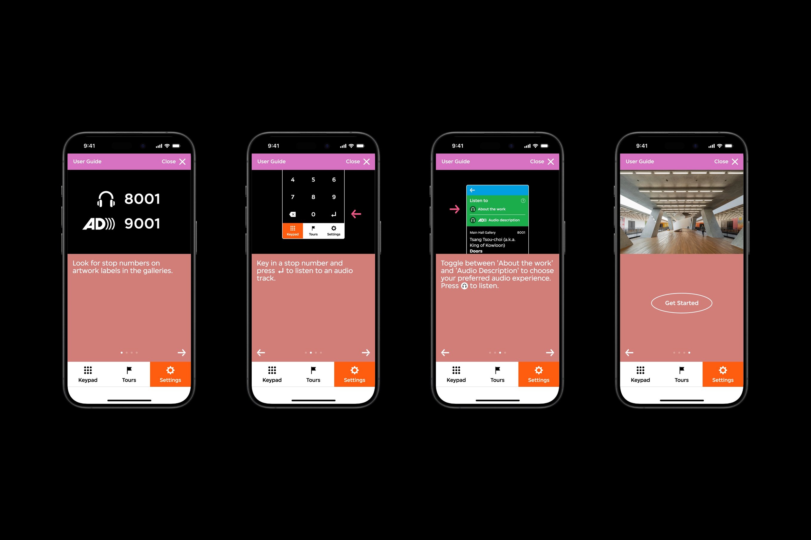
There are three audio guide interfaces. Each interface features an illustration that instructs a user of the audio guide's function, such as audio stop numbers, the keypad, and the ability to toggle between two audio tracks.
The user guide illustrates the primary functions of the audio guide aided by diagrams, focusing on audio stops and audio track usage.

A user guide nested under “Settings” explains the primary functions of the audio guide, such as entering work stop numbers and switching between two types of audio.

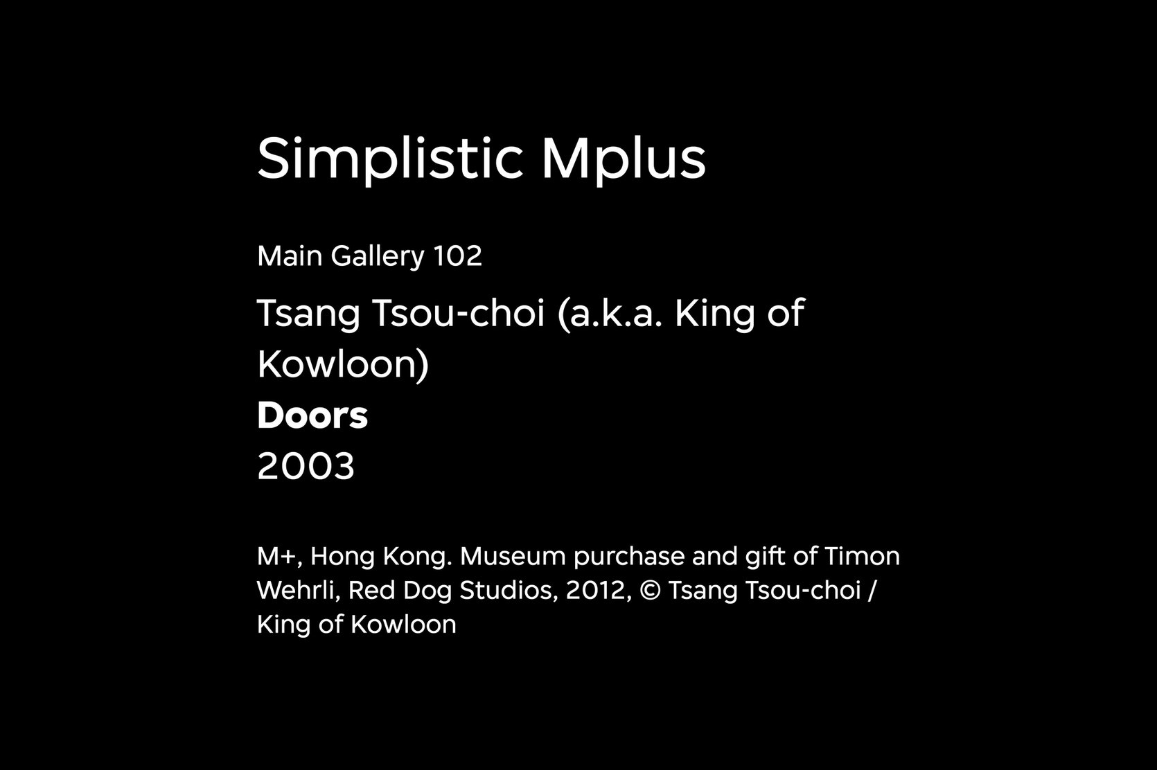
A representation of the visual hierarchy of work location, artist name, work name, year, and captions.
We created a visual hierarchy that differentiate work location, artist name, work name, year, and captions.
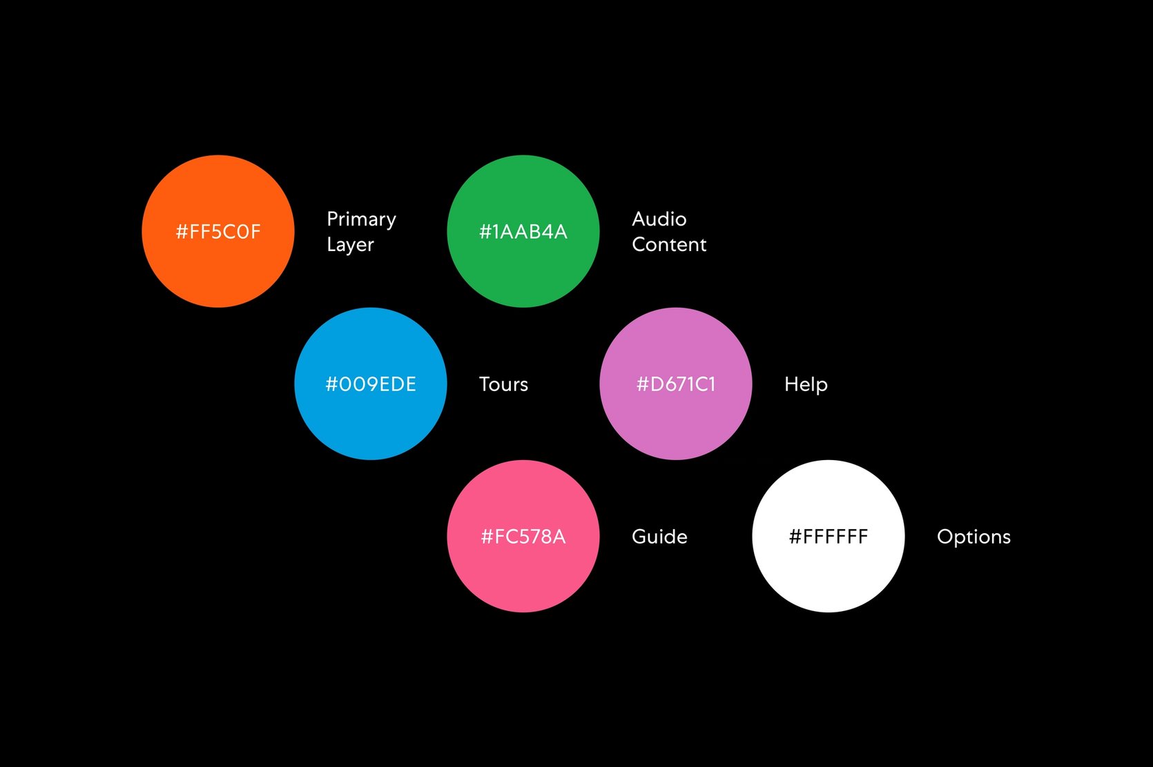
A diagram with a set of colours and their association with the audio guide's pages and functions.
We assigned a set of colours from the museum’s visual identity guideline all interfaces and functions.
An overview of the M+ audio guide interface.
A bird's eye view of an iPhone on a wooden stool.

The M+ Audio Guide project was led by Nic Chan, Jimmy K.K Lam from Studio Earth, and Jarijn Nijkamp with the Digital and Editorial Content, and Learning and Interpretation team at M+.

This case study was written by Rebecca Isjwara and Izumi Nakayama.

Back