Chartwell Capital
A reformation of a local legacy
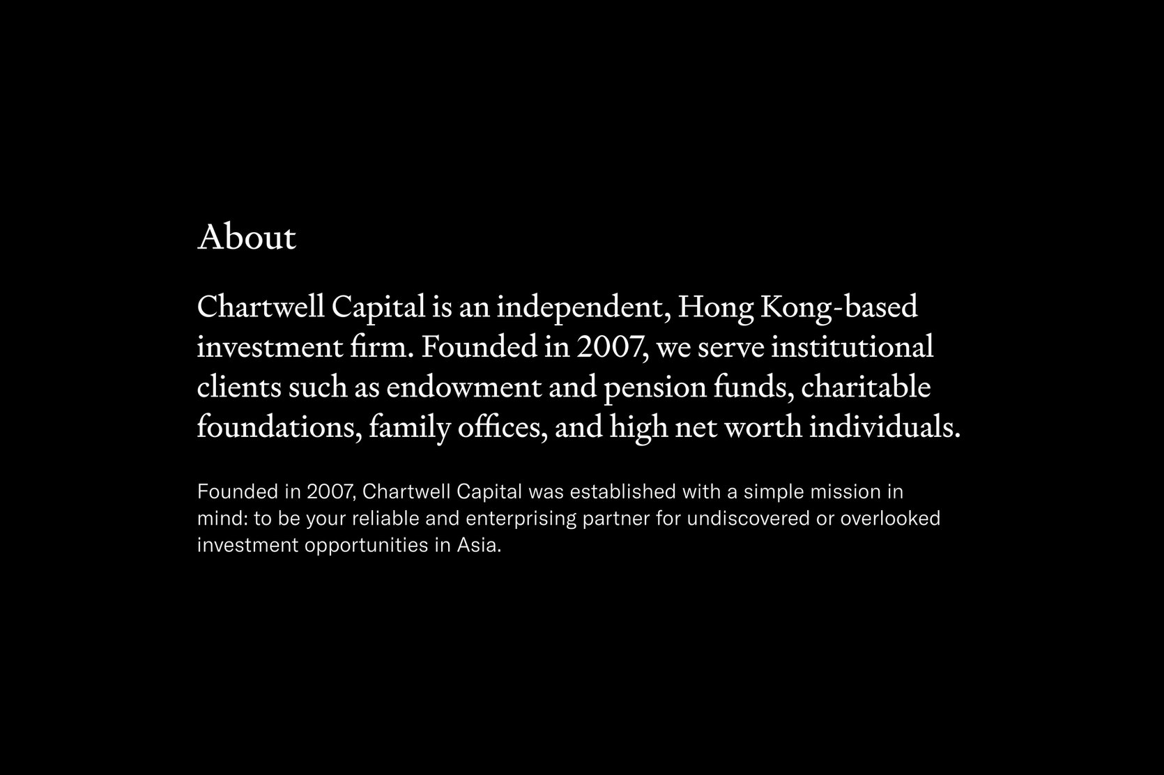
Chartwell Capital is an asset management company in Hong Kong that serves institutional clients, including endowment and pension funds, charitable foundations, family offices, and individuals.
The company commissioned Jimmy K.K. Lam of Studio Earth to refresh its image with a timeless, contemporary aesthetic. Chartwell Capital's new brand identity should also respect its cultural and familial roots.
Team
Jimmy K.K. Lam of Studio Earth on consultation, project management, visual identity, user experience, and interface design.
Stock Photos
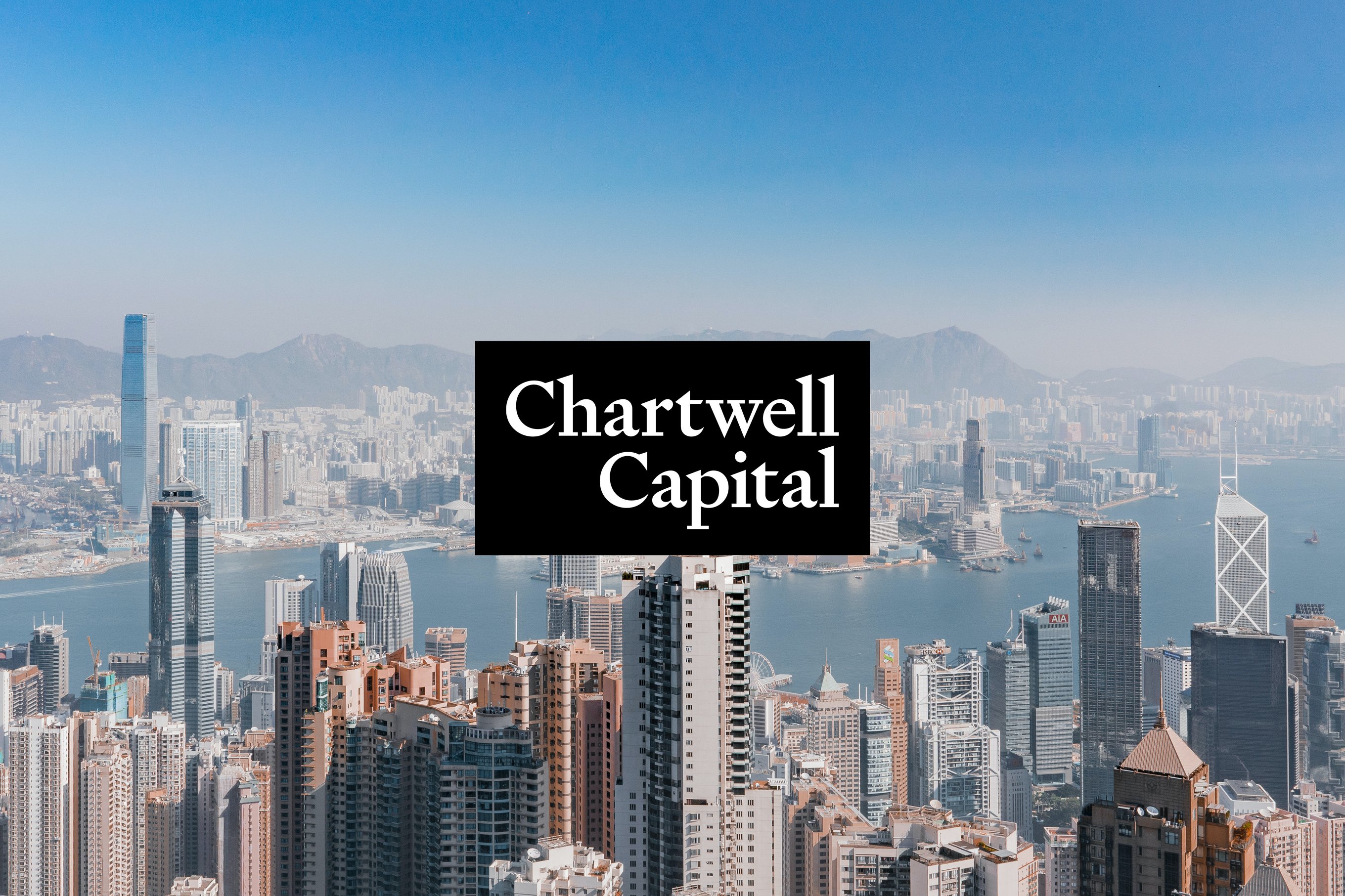
Chartwell Capital was established in 2007 as a family office to explore investment opportunities in Asia. It has since evolved into an asset management company, utilising its local expertise to engage with companies and cultivate long-term client relationships.
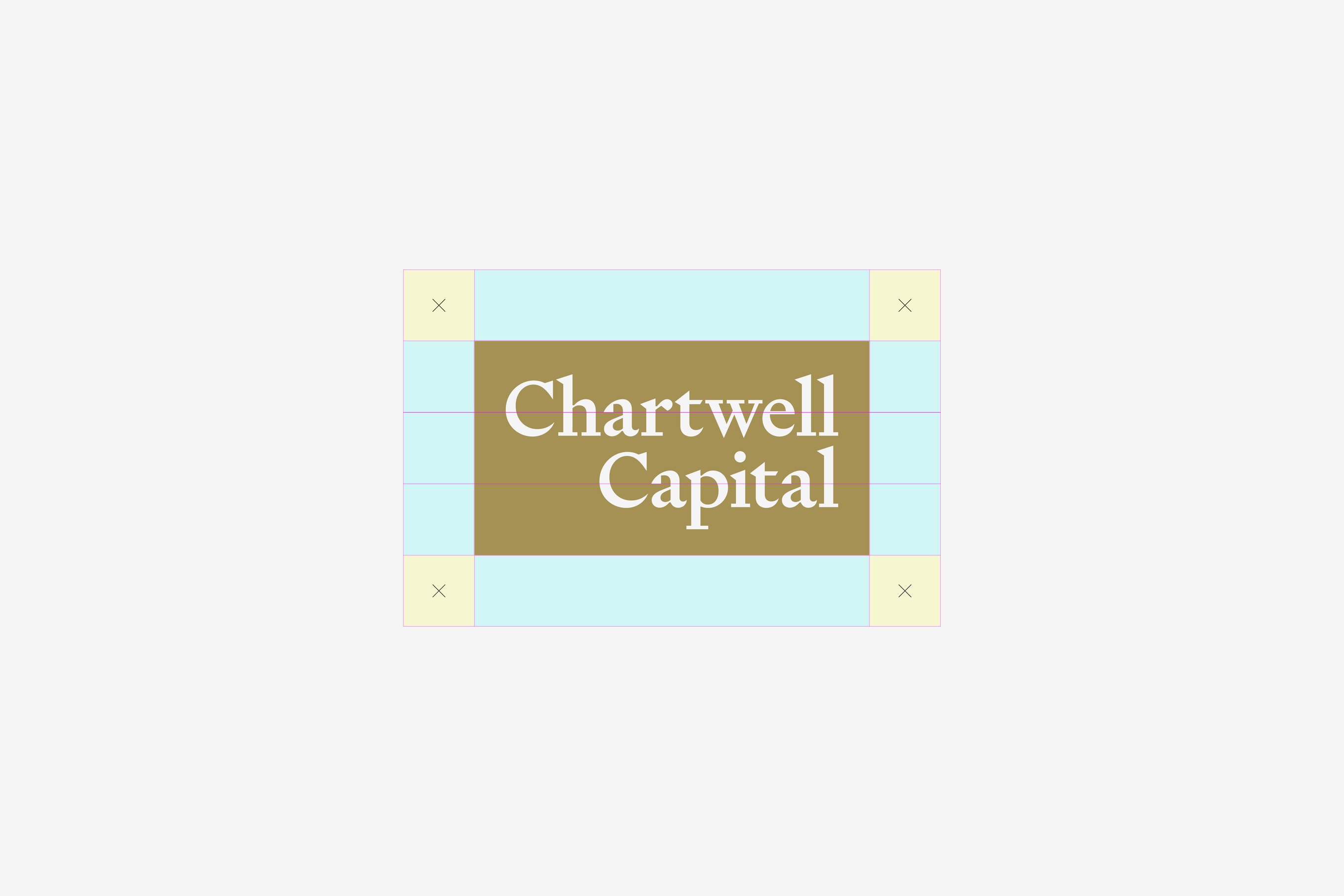
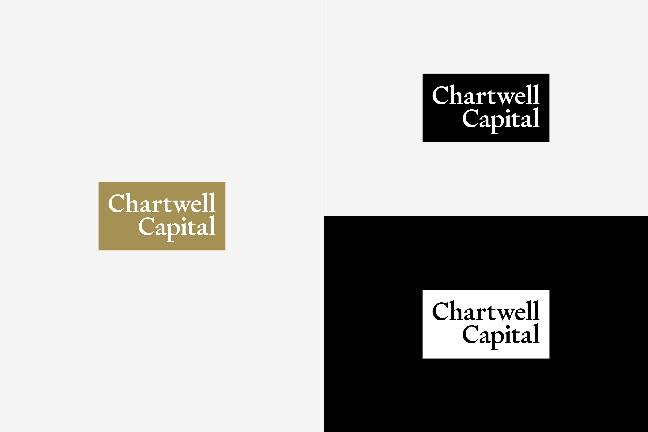
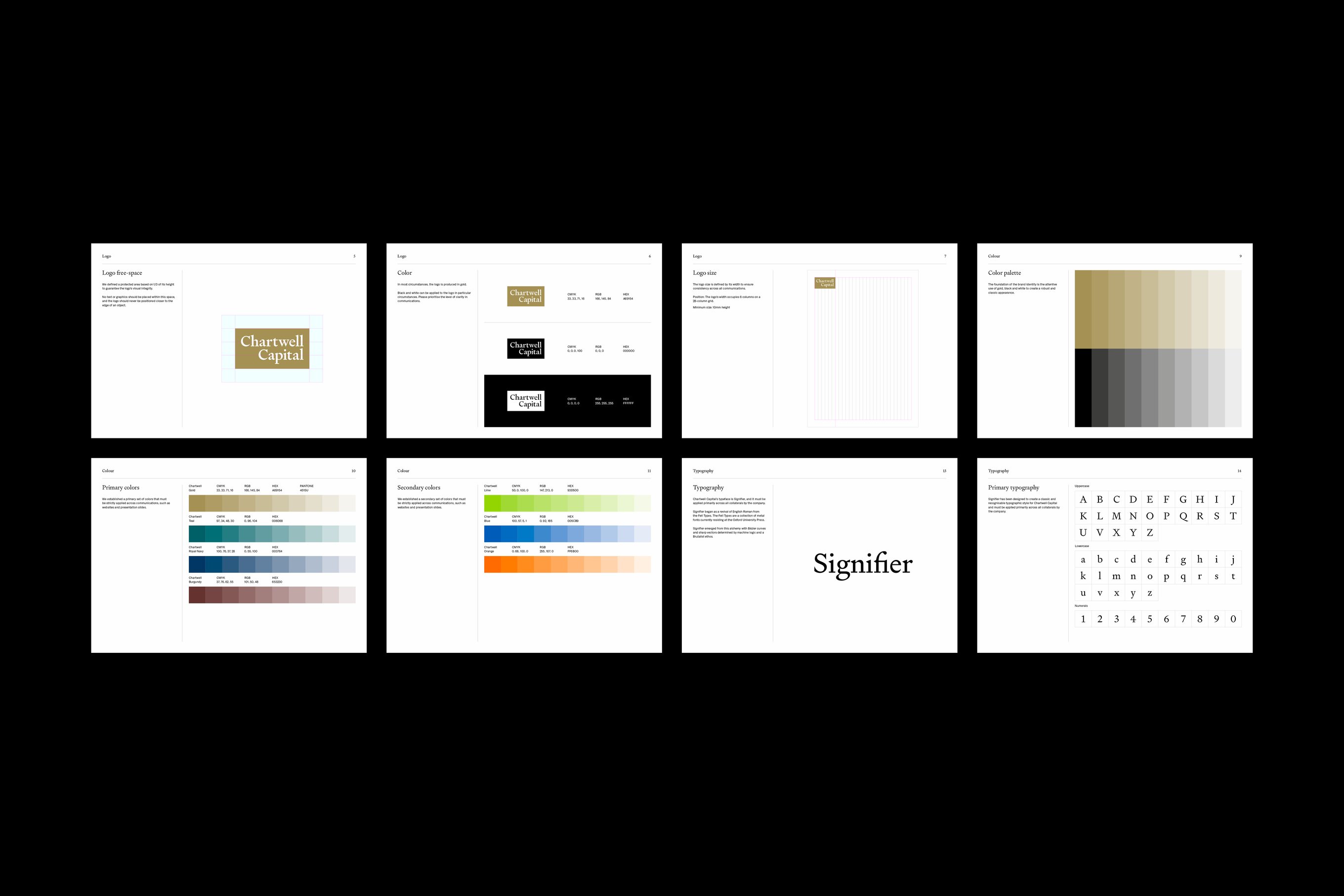
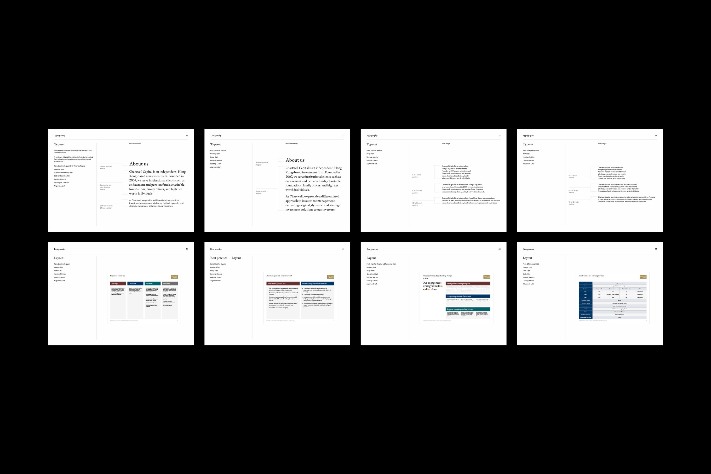
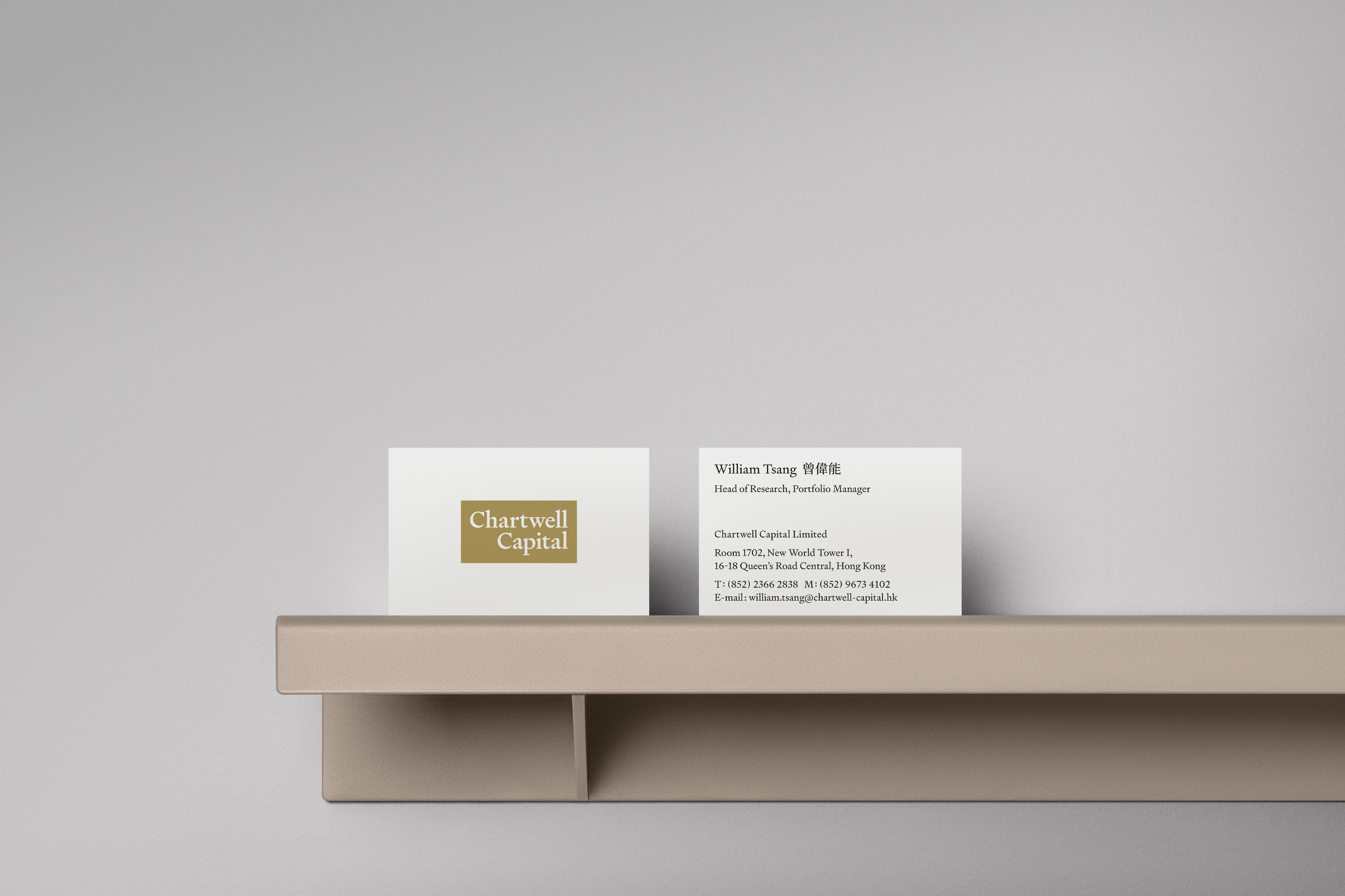
We aim to convey Chartwell Capital as a dependable and sustainable company, so we have preserved elements of the original brand identity, such as the serif typeface and its primary colour. In addition, our design principles ensure clarity and legibility throughout all brand touchpoints.
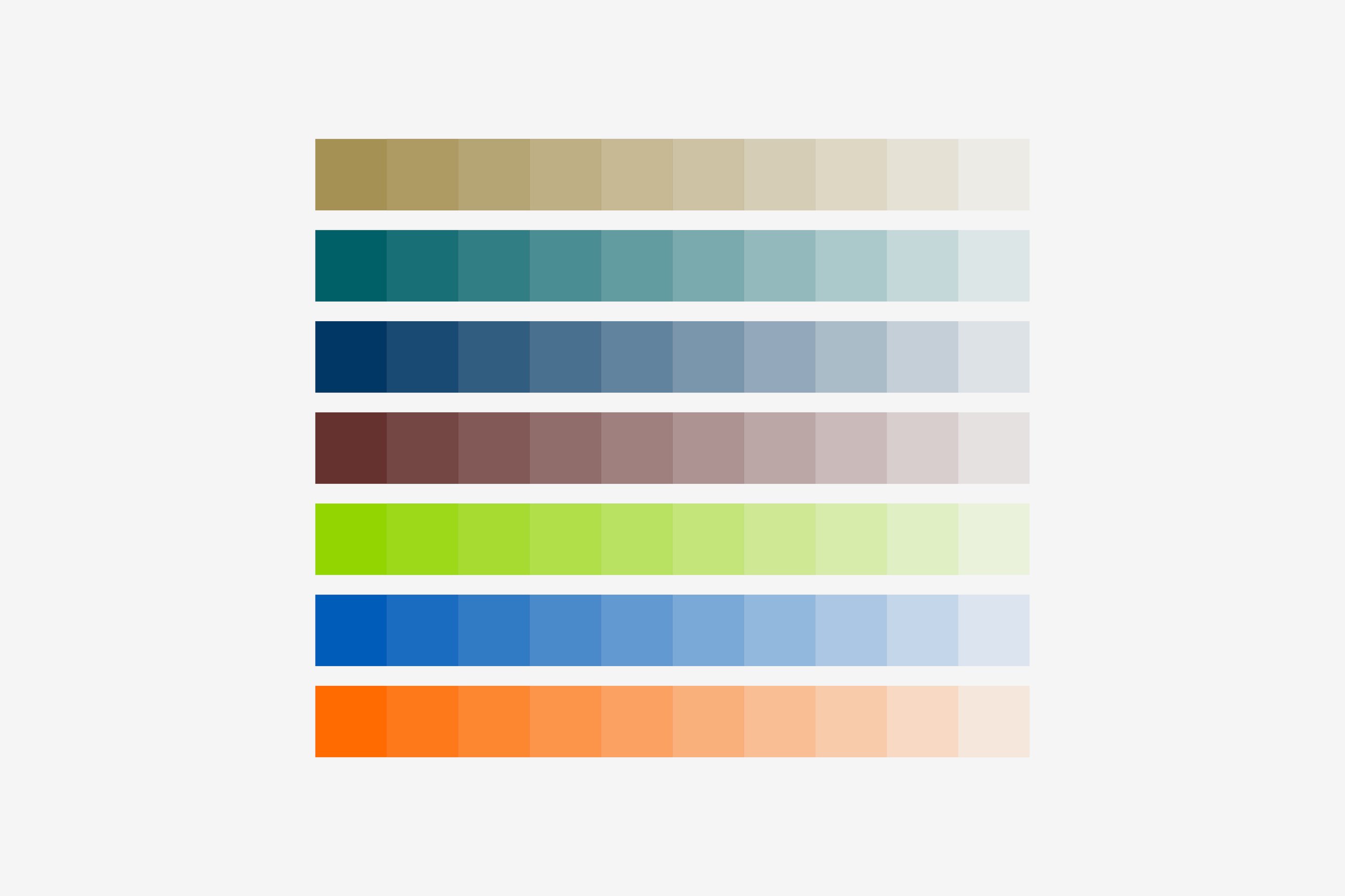
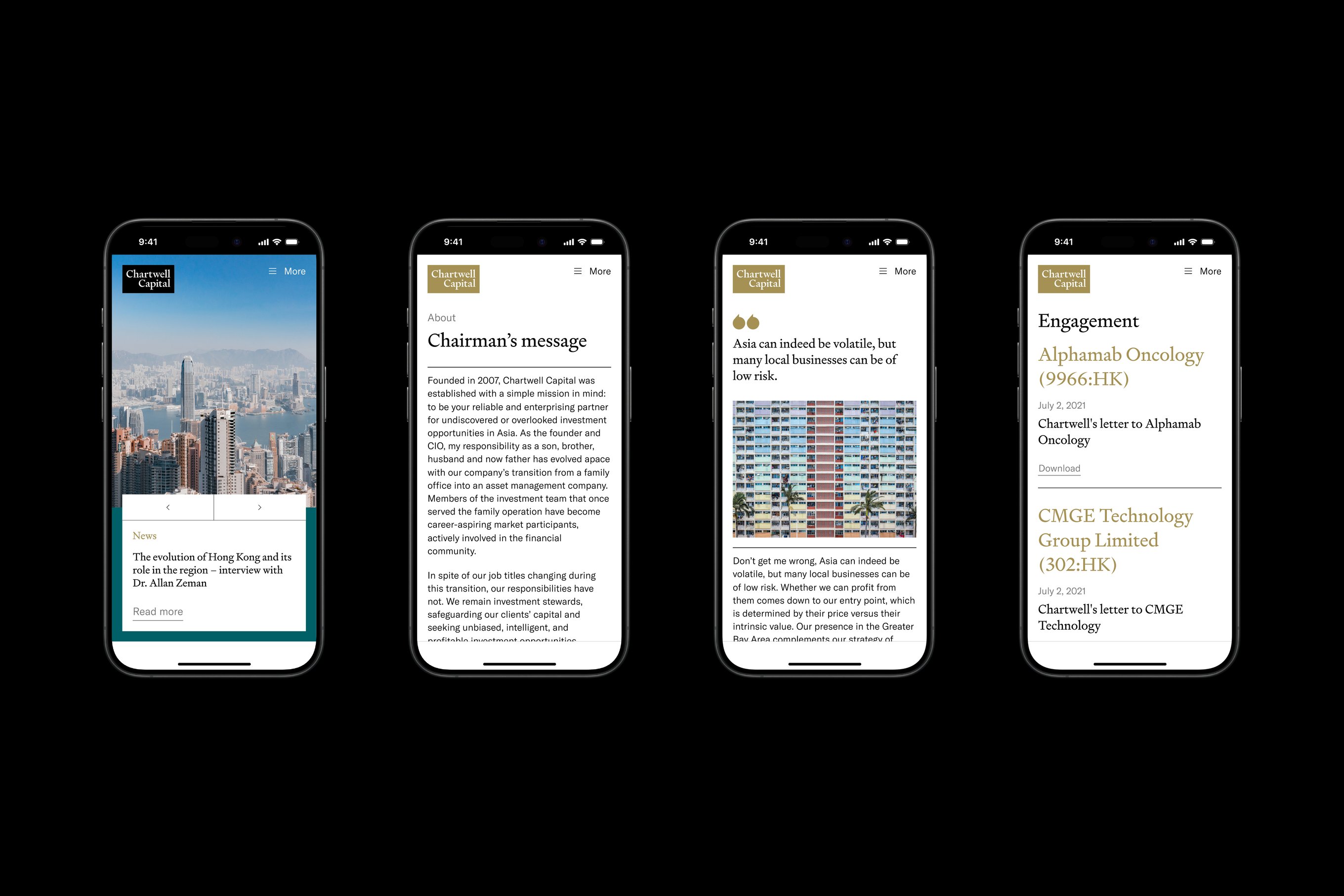
In addition to the core colours of gold, black, and white, we have included teal, navy, and burgundy in its palette for application across touchpoints, such as the website and presentation slides.
Vibrant, accent colours such as lime, blue, and orange aim to emphasise crucial details in documents and reports while preserving Chartwell Capital's impression by drawing contrast with its core colours.
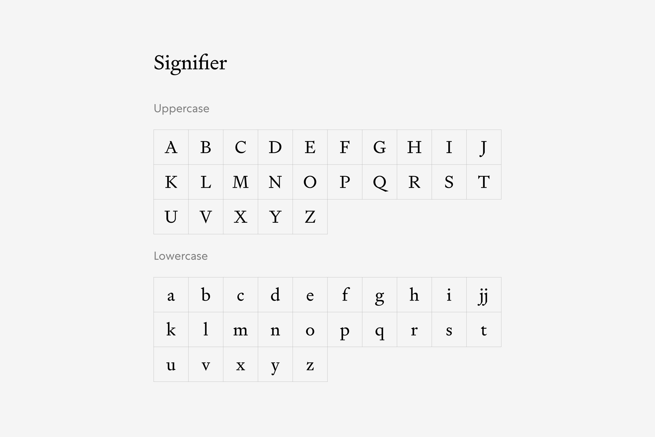
We selected Signifier, designed by Kris Swoersby, as the brand's primary typeface. Our serif typeface is visually heavier, making it optimal for headings and standing out against neutral backgrounds.
We selected GT America as the system font, a sans-serif typeface with American Gothic and European Grotesque elements that contrast Signifier's functionality.
The Chartwell Capital project was led by Jimmy K.K. Lam of Studio Earth.